


I have someone working on a new logo for me, and I am stuck. She came up with about 30 designs, and I have narrowed it down to 3. Which one do you guys like? Thanks
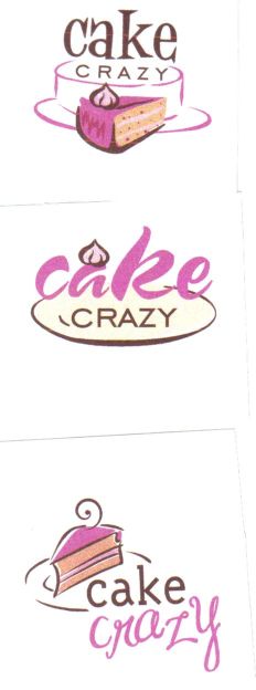

I like the third one, with the slice of cake on a plate. Very cool! ![]()

I am leaning toward the third one also, but other family members like the other 2. I guess I will have it figured out. I am going to see which one does better on here, and go from there. Thanks!


I like the first one, but would prefer the cake slice on the plate with the wording above and just lose the outline of the whole cake. (yeah, I know I'm changing it. Sorry.) ![]()

i like the third one. if you do use the first one, i agree with messiet about taking off the dollop of frosting.
I like the first one, but would prefer the cake slice on the plate with the wording above and just lose the outline of the whole cake. (yeah, I know I'm changing it. Sorry.) ![]()
I like the third one, but instead of the little curly on top of the cake, put the dolop of cream that's on the first two!
Great logo!

I like the third one!!! just the way it is...
When I think
Cake Crazy, I think I should see a Crazy Cake, the little curl on top gives me that impression.
Great Logos!


I like the 3rd one too! I am not a fan of the second one at all.
HTH! ![]()
I am leaning towards the third one. I think I like the font better. The first one is nice, but the font just isn't "crazy" enough for me. Plus, I like the little swirly on top of the third one's slice. ![]()

I like both the first and the third one also. I like the third one the most!!


She is going to send me a revision of the third one with a funkier font. Thanks guys!

Ok, I know I'm late, lol, but I agree with those who said the 3rd one, but with the 1st one's font - which looks like is what you're going with!
Can I ask who's doing it for you & how much they're charging? I want a logo but they're so expensive, and the people I've talked to will only do like 3 that you get to choose from. (You can pm me.)

I like the third one with the slice of cake, and "crazy" looking crazy...
Cheers!
BakingJeannie


I like the third one the best!
It's probably just me..but the first one looks like a piece of cake right in front of a whole cake. I might like it better if the image (cake) behind looked like a piece was taken out.

The third one is so cool!! I love it.. Good luck! ![]()

I like everything about the 3rd one best - the cake image (which you need to have since it has this sugar-aholic thinking I need a piece of cake already)... and the fonts used. I especially like the "cake" with pink & its' font. This may be a weird suggestion, so take it or leave it, but what if you had her change the little whipped-cream on top to swirl the other way, or a little wider at the base & then point up... the only reason I mention it, is because my mind said "steam" when I saw it... but maybe that's because I just drew steam on a cake that way (copied from clip-art). I love it how it is though! Aren't logo's fun! I like yours!
Quote by @%username% on %date%
%body%