


Can Ya'll Tell Me What You Think Of These Colors?
Decorating By justfrosting Updated 18 Dec 2006 , 5:51am by socake

It is for Christmas mass...The holy family will be under the top teir, inside the colums. There will be one star above and fondant angels "flying" in the sky attached with floral wire. Blue will be touched up with luster dust.
Down below there will be fondant figures of people on their way to see Jesus.
Not sure about the green and blue combo. What does everyone else think?
Sorry for the terrible pic. I did it in PAINT and then had to take a picture because it would not attach. ![]() Computers can be so touchy.
Computers can be so touchy.


Honestly? My first reaction was "hmm..no" but then I read what you are planning to do with it...I love it! It made more sense to me then (my brain isn't fully functioning yet this morning ![]() ).
).
I'd love to see the finished cake!
Ugh--I had a feeling this was not going to work--I wanted Green for the land area and dark blue for the sky but maybe not...
Please I need more opinions to help me decide ![]()
![]()

How about a cake that starts as the darkest blue for the top tier, then gradually gets lighter blue for the descending tiers?
I like that idea more, because I find more people avoid eating dark/bright icings because of staining their teeth & mouth....but that way, your darkest icings will be the smallest tiers anyway.
Well, I was just thinking in terms of your traveling fondant figures being sillouettes and the Holy Family being "3D". It could be that I am not seeing the green in the exact shade that you are wanting. If you used green....how about some brown somewhere for mountains, desert, etc.? I know, it's more work and you may not have the time for that (which I TOTALLY understand!!!). Please make it your own!!! I'm sure your church will love it and it will be beautiful!!
Beth in KY
I hope my response was NOT discouraging to you. I think it's a wonderful idea. I looked at the picture before I read the "vision". That's when I started to think of a "dirt" pathway to the top, little camels (whether you intended to put them there or not...that's what I saw...LOL), the shepherds etc. Once I thought of it as grass and sky, I "got" it. It's great! ![]()

Personally I like it. I got it as soon as I saw it. The people are going to be on the grassy land (green) with the dark blue night sky above them and the star is in the sky.
The green is a bit brighter than what it looks like.
Thanks everyone for your answers!


I like it a lot, especially with the luster dust on the top. I don't think I would put pathways or anything, just leave it plain. I am Catholic and would totally rather have the focus on the top layer. Leave it simple and just put your figures up the sides with no pathway. I would love to see your finished cake, too!


Blue and green are complimentary colors. I would add a little of the blue to the green to accent the blue sky. It will mute the green so that you "see" the blue first. HTH. LOVE the idea.
Well--it seems that some folks like it and some don't. This is what I get for thinking on my own...
I would like to jazz up the green a little. Maybe the whole thing should be luster-dusted--I am really stuck.
This is going to be seen by my entire church so I am hoping some inspiration hits soon---Thanks everyone.
How about some gold arabesque swirls painted on it, just to brighten it up?
Theresa ![]()
Blue and green are complimentary colors.
Correction to my first post: ****COMPLEMENTARY****
Actually, no they are not. They are far from complimentary (what a paradox, no? "far" from complimentary although they are right next to each other on the color wheel).
My suggestion was to lighten the color graduation so that it doesn't seem to "BAM! the color has changed!" There was no need for a smart remark.
But then again I'm ill, so I may be cranky today, I'll probably have to apologize when I'm better. ![]()

Well--I am going to go for it.
It will end up having a lot of colors--wise men with gifts, shephards with sheep, angels, etc plus some palm trees and grass piped to border.
I am thinking about maybe making it topsy turvey but haven't completely decided--maybe too much work.
I love CC and all your honest opinions.
Don't topsy turvy it. That well bring too much whimsy to a serious image, well, that's my .02. Keep it simple...

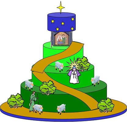
I drew this one up for you based on your original design!
Shepherd with sheep, Angel, path, some bushes and stars in the sky!
I liked the green you had but it is was strong so made each tier a lighter shade so it lookes like the star on top is lighting the land.
Good luck with your cake!
Sandra
Socake, that is beautiful. If it was my cake, that would be the design. May I copy it for my Christmas card for next year? No, seriously, I would love to send that one out to my cake decorating friends.
Theresa ![]()

Truly, when you think of the night of Jesus's birth and the whole journey the Wisemen took, etc the main focus should be the Nativity. See if you can graduate the colors to bring the eye up to the main theme of the cake (the Holy Family). A beautiful idea and I am sure it will be well received and wonderful.
Rebecca
I love your idea! I wouldn't luster dust the whole thing, I would just do the blue! I love the colors, don't forget that they will just be background to your image, your characters will offset the color difference! Good luck! I'm sure it will be breath taking! I can't wait to see pictures!

Well, my question would be, was the terrain in Bethlehem desert or grassland?
If the tiers were more of a tan with swirled green or piped on pieces of grass (with the grass tip) then the green wouldn't be so overwhelming, and the blue and nativity would really stand out.
And no terrain is only one color. For simplicities sake, I understand the monocrome, but....oh, I don't know. I think a tan or brownish color would fade into the background better than the green. Just my opinion though. I also think the colored figures will show better on a muted background.
Just my opinion. Not intending to offend anyone.
Then how about airbrushing it with some light streaks of food color, to give it a more natural look?
No airbrush? Then diluted food color and a clean sponge will do very nicely, right?
Theresa ![]()

Oooh - I do like the idea of the base tiers being tan/beige with accents of green grass here and there. It wouldn't be so dark on the bottom and it would lead your eye upwards to the main focus of the cake.
Can't wait to see the finished product!
Oh Brother--I feel several late late nights coming on. ![]() I can't wait. All your ideas are so wonderful.
I can't wait. All your ideas are so wonderful.
I am definately using the graduated colors. They look so pretty! As far as the actual terrain of Bethleham---uh...hmmmmm.
I guess I will google it. ![]()
Okay, I've been thinking a bit...there are shepherds in the fields in that region, keeping watch over their flocks by night. So, there must be some green. But, looking at the maps in the back of my Bible, it appears to be somewhat hilly, and on the boarder of dryer land. So....whatever I guess. It is your interpretation, and you should do whichever feels the best to you.
I can hardly wait to see your finished product. All this talk has made me start to work up my own version too. Maybe next year!

Ok, there are so many wonderful ideas here on this post. Makes me want to try a cake like this, too but not time this week!!
Here is my 2 cents.
1. NO topsy-turvy. Too whimsical for this cake.
2. Graduated green colors with the lovely blue on top.
Keeping the background simple will keep the focus on the figures.
3. Luster dust the sky.
4. I don't know if this would work but maybe on the green tiers you could use some luster dust or a very close shade of green petal dust and just do little arches/arcs to give the idea of the land being rolling or slightly hilly. Like you would if you were going to draw hill but just using a sponge or dappled look. Does that make sense?
I know it will be beautiful whatever details you finally do. Be sure to post a picture.
Blessings.
Cindy
Quote by @%username% on %date%
%body%