


Can You Help Pick A Logo? Please Asap Tonight!
Decorating By Rainbow_Moon Updated 19 Sep 2005 , 1:58pm by aunt-judy

I'm attaching two choices I've played with for a logo, I was hoping a few of you could offer guidance on which you like better. I like doing more sculpted cakes and not so much the wedding cakes so I don't want to be too prissy, but I want people to think I'm a good baker and decorator. I'm doing business cards tonight to give to an order tomorrow (I've blocked out my contact info) to give to all that request it once they taste my wonderful goodies! ![]()
Please let me know what you think as soon as you can! Also suggestions like to switch colors or change fonts or move a star or something would be really cool too! Thanks!!!! 
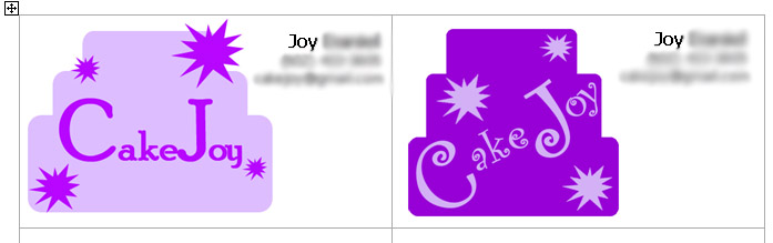

Wow, I like them both, they are striking! I think the one on the right is probably a bit funkier, but the one on the left is actually easier to read. But honestly I like both of them, so you should go with your favourite.
Hugs Squirrelly


I really like the darker purple cake with "Cake Joy" on a slant. My only suggestion would be to widen the cake slightly so the word "Joy" doesn't look so squeezed in. The font (is it Curlz?) looks great.
i CAN do the funky font on the left. they're all my design, i have been working on the designs for about a week but can't come to ANY decisions! my fiancee says he likes one, then the other, so he's no help!
Yes, the font is Curlz.

i like the one on the right but i agree that the word joy looks cramped......maybe if you adjust a little ....but overall i think the one on the right stands out more.

Ok....here goes!!
Love the name, btw!! It's great!
I think the color and font and shape on the dark purple one is better....but the text needs to be horizontal, instead of tilted. You don't want people to have to work too hard to read the name, know what I mean? And maybe try a different color on the text and bursts, just to see how they look...either white or magenta/fuschia? It needs to jump off of the purple a little more, maybe. If no other colors look as good as the lighter purple for the text, stick with that, but maybe go a teensy bit lighter with it.
BTW - working with and creating graphics is my other hobby!!! lol I'm working on my card right now, too! ![]() My business name is "Sugarbelle's - The Sweetest Things in the South!"...thanks to help from MissMersh, here at CC for the tag line! I just have no clue of where to start with a logo, though...
My business name is "Sugarbelle's - The Sweetest Things in the South!"...thanks to help from MissMersh, here at CC for the tag line! I just have no clue of where to start with a logo, though... ![]() Originally, I was going to be "The Cake Fairy"...but there's someone with that name over in the UK & they've already got a website up and all, so didn't want to cause confusion.
Originally, I was going to be "The Cake Fairy"...but there's someone with that name over in the UK & they've already got a website up and all, so didn't want to cause confusion. ![]() But I had a killer logo made up....complete with a picture of a flying fairy carrying a cake!!! Then I considered "The Flying Cake" - a little funky, I know....hence my avatar...but the longer I thought about it it just didn't stick with me...I was so bummed thinking I'd never decide on a name...but I think people down here will respond better to Sugarbelle's...we'll see!
But I had a killer logo made up....complete with a picture of a flying fairy carrying a cake!!! Then I considered "The Flying Cake" - a little funky, I know....hence my avatar...but the longer I thought about it it just didn't stick with me...I was so bummed thinking I'd never decide on a name...but I think people down here will respond better to Sugarbelle's...we'll see!
Hope my suggestions/insight helped you!! Sorry for my rambling!! ![]()

The one on the right ROCKS! I think the logo on the right conveys a clearer message. It reads faster and cleaner. I think you want something that people can identify quickly and easily.

thanks for all the posts, i'm going to see what i can do with the right one...i'll post another in a few min!
If you could also fit a big star on the right hand corner like you did on the left logo, onto the right logo, I find this really draws attention to the card.
Hugs Squirrelly
May I ask what programme you are using? If it's PrintMaster, I can tell you how to get the font "curlz" to look a little bolder so it will show up better on a business card.
nottawachelle...i am using photoshop to put together the logo part and then dropping that into Word to set up the printing of the cards. once i get the logo down i plan to make up some stationery as well as set up my webpage.
here's the newest...i'm too tired to do any more editing! i'm throwing it on the cards and going to bed  ...zzzZZZZ
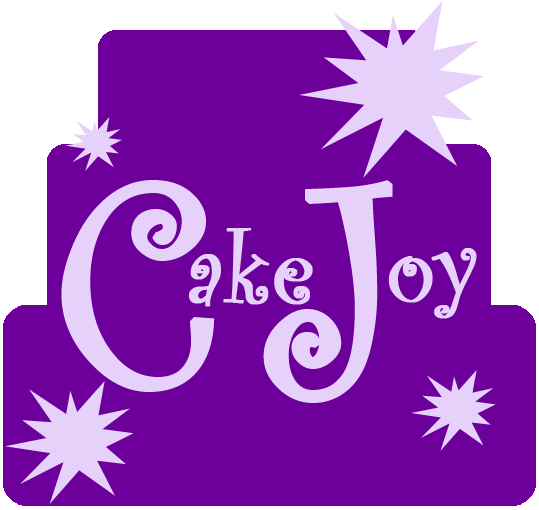
thanks jenn...of course i am tweaking some more...as i put them on the cards the text was too heavy (since it got shrunk) so now i'm fixing that...argh, it's almost like a cake! 'just one more thing...' lol
I agree...working on graphics is soooo much like working on a cake!! lol You can tweak until the cows come home if you, or someone else, don't just stop yourself!! You can make yourself crazy trying to get it just right. lol I make all my own birthday cards, party invitations, and christmas/anniversary...just cards for anything. As well as all of the logo/graphics work for our landscaping business. My DH says I really need to make a small business out of it...I told him then I'd have to charge him retroactively 'cause he's been my biggest customer!!! lol ![]()
Sweet baby is awake again ![]() so I'm back to look. Hey, very Nice! Eyecatching and easy to read. The purple cake looks funky and the stars amd font suggest creative flair!
so I'm back to look. Hey, very Nice! Eyecatching and easy to read. The purple cake looks funky and the stars amd font suggest creative flair!
I totally agree that graphics is a lot like cake work. I also design all my own cards and family newsletters along with brochures, cards, newsletters diplomas, and letterhead for our local homeschool group and many cards and brochures for my mil's singing trio.
Always nudging and tweaking something! ![]()


I love the logo you chose. It looks great! And not to throw a wrench into the mix because the logo is awesome, but have you considered putting pictures of your cakes on the business cards? I have my wedding cake on my cards (I made it). I think having your cakes right on the business cards is good advertising. It showcases your work and gives them your contact info all at the same time. Right now, I have only 1 picture (my wedding cake) on my business cards, but as I start making more cakes, I'm going to put different pictures on them. This way, there will be different pictures of my work out there for people to see. Just a thought.
I like the new one, too. I got to this post late. But I do think that the last version was the best choice!
Tanya
This one is perfect, it is easier to read and it really stands out, l like the stars, reminds me of a cake I did! Good work kiddo!
Hugs Squirrelly


Quote by @%username% on %date%
%body%