New Website

Business By SpudCake Updated 16 Apr 2007 , 6:01am by Tweetycup

SpudCake Cake Central Cake Decorator Profile
SpudCake Posted 13 Apr 2007 , 3:12am
post #1 of 13

I just finished my website, it still needs some work but I thought I would share it and get a little constructive advice. Thanks for looking.

Joanne usaribbon.gif

12 replies
mkolmar Cake Central Cake Decorator Profile
mkolmar Posted 13 Apr 2007 , 3:44am
post #2 of 13

I think it looks great. It's clean cut and easy to navigate. The only thing I would suggest is to have the pink sentance in the home page a darker shade of pink so it can be a little bit easier to read. (I've got some bad eyes icon_redface.gif )

terabera69 Cake Central Cake Decorator Profile
terabera69 Posted 13 Apr 2007 , 3:45am
post #3 of 13

What is the link?

Confectionary2 Cake Central Cake Decorator Profile
Confectionary2 Posted 13 Apr 2007 , 3:55am
post #4 of 13
Quote:
Originally Posted by terabera69

What is the link?


Click on the "www" on the bottom of her post icon_biggrin.gif

idoweddingcookies Cake Central Cake Decorator Profile
mendhigurl Cake Central Cake Decorator Profile
mendhigurl Posted 13 Apr 2007 , 4:01am
post #6 of 13

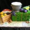
I think it's good as well... the only changes I would make are make you're title bigger and make it pop out. I would maybe use a larger different (fancier) font. Also the picture seems to be of the pillars instead of the cake, maybe get more of the cake in there? And finally, maybe pick one font for the body, and stick with it. Maybe you can add a contact tab on top where the empty space and move that info. there? You're cakes look great, btw! You may want to think about watermarking them since they pop up in such high res. and large format.

Cookie4 Cake Central Cake Decorator Profile
Cookie4 Posted 13 Apr 2007 , 4:11am
post #7 of 13

I really love the way your photos have a horizontal slider bar. That makes much more sense than clicking on individual pictures. I really love the site but I think the first page is too wordy and needs to be more showy. I agree with the comments of others about the font and colors.

Good luck and I hope you make a million! thumbs_up.gif

marthajo1 Cake Central Cake Decorator Profile
marthajo1 Posted 13 Apr 2007 , 4:17am
post #8 of 13

I like the way you have info about the character cakes on your site! Very smart!

terabera69 Cake Central Cake Decorator Profile
terabera69 Posted 13 Apr 2007 , 1:22pm
post #9 of 13

Thanks for the link. I had a feeling that it was right infront of my face. Bad eyes, too!!!!

marthajo1 Cake Central Cake Decorator Profile
marthajo1 Posted 13 Apr 2007 , 2:54pm
post #10 of 13

One thing I did notice, in the gallery there are horizontal sliders and vertical sliders. If you space the lines of photos maybe you can get rid of the vertical sliders. At first I couldn't figure outwhy I couldn't read the category titles! icon_smile.gif

cambo Cake Central Cake Decorator Profile
cambo Posted 13 Apr 2007 , 7:37pm
post #11 of 13

I think it looks great! Very easy to navigate around! One thing you may want to elaborate on is your pricing. I used to say that my prices "started at".....and that began to drive me nuts when I started to get calls! I now list what sizes are how much and etc.!

SpudCake Cake Central Cake Decorator Profile
SpudCake Posted 13 Apr 2007 , 8:12pm
post #12 of 13

Thank you all for the great advice. It is nice to finally have it up and running.

Joanne usaribbon.gif

Tweetycup Cake Central Cake Decorator Profile
Tweetycup Posted 16 Apr 2007 , 6:01am
post #13 of 13

Looks good.
The main page has to many different font colors. You May want to choose one color and go with it.
Also the scrolling banner... those things give me a headache. They keep going and going and going...yuck.
I know it's used to get people's attention, but I would just use a basic header. Get's people's attention without the annoyance. That's just my opinion on that.
Your colors and the way everything blends together works really good.
Congrats on your website.

Quote by @%username% on %date%

%body%