


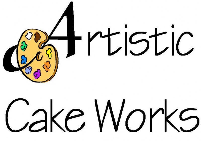
I have, out of frustration and lack of funds to pay a pro, designed my own logo. Once I have decided that this is the design for sure, I'll take it to a printer to have the font perfected. I thought about having it all raised, with the splotches of color on the palette raised as well.
I'd love to get your input, suggestions, critiques, etc. All I want are HONEST opinions.
Thanks for your input, ladies and gents!


Hi ericsmom, it's me, PMd you.
Wanted to bump the post too!
Aside from getting it cleaned up a little, it might be nice to have a more vertical option that reads completly left to right.
OR, twist the pallette down so that it fits in snugly with the text below and is a little more of a square shape?
I think you have a neat idea going.


thanks all! i actually have already filed the fictitious name, so yes, i'm married to it.
seems the name somehow stuck in my head, as its very similar to the tattoo shop that i've used a few times "Artistic Body Works". I swear it wasn't intentional, guess it was just catchy enough to stick.
never thought of autistic. but now that i look at my drawing, i see what you all are seeing. well, i either change the name and eat the $50 and pay again, or do something with the font to make it read correctly. i hand drew the whole thing, as i can't figure out how to do graphics on a computer, so thats probably why it looks like it does.
i'm glad my cakes look better than my drawings! Doug, i love your idea, especially since i can see the "r"! And again, thanks so much for posting the blank cake drawings. i used them tonite for a double consultation, and got two deposit checks! it made it alot easier for the brides to picture their cakes.
ok, time to go play bedtime patrol to the kids. thanks again everyone!
Quote by @%username% on %date%
%body%