


Hi all
I am just about to open up shop within the next month or so, all being well
I am going to be selling your basic home made style cakes, such as Muffins, Chocolate brownies, carrot cakes, cookies, sandwhiches and a little retail farm shop side too.
Its all happening nbow finally after 6 monhs of planning permission, etc etc, so I am working with a logo designer at the moment and have him the specs of our proposed idea, but I wanted some professional and unbiased opinions and I often come to this site, just to browse but never signed up :)
Can I ask your opinion on this as a logo, be as harsh as you want (ignore the black backgorund thats just to make logo stand out, but will be cropped)
http://img.photobucket.com/albums/v140/markfj/mid_zps54a4a424.jpg
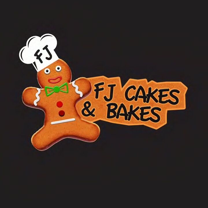

I think it sounds good. The rhyme makes it easy to remember. and the ginger bread man look awesome. IMO it's a 
Here's my unprofessional initial reaction to the image:
There's something about the face of the gingerbread man that is kind of creepy to me...It looks like the eyes are staring straight at you and he doesn't look happy (like a sinister clown) maybe it's just me. LOL!
I think the overall design with the gingerbread man and the sign, along with the rhyming name, are very cool!
Seems, I must have double posted this! Sorry guys, my PC is beyond bad at the moment.
Thanks for the info a feedback on our name firstly, glad people like the name at least :) The gingerbread man seems a little more controversial but hopefully we will get there in the end
Thansk again guys
Quote by @%username% on %date%
%body%