


Helpful Critique On My Website Please ?
Business By sugarsugargal Updated 6 Sep 2009 , 11:54am by Bel_Anne
Would anyone be willing to give me some helpful info, be gentle on me, its still a work in progress, thank you. I value opinions here ![]()
www.sugarsugarcreations.com

Wow, I think the site looks great! And such amazing work in your gallery too!


Mensch I agree with you ![]() ..but until i have more pics i cant sub-head...this is pretty much all the work i have done, i need some more orders to photograph !
..but until i have more pics i cant sub-head...this is pretty much all the work i have done, i need some more orders to photograph ! ![]() as soon as i have more pics i will do as you suggest, it makes it clearer doesnt it
as soon as i have more pics i will do as you suggest, it makes it clearer doesnt it ![]()
thanks to indydebi and kelly 0406 for taking time to look and comment ![]() appreciated ! xx
appreciated ! xx

Looks really nice! Very professional, and your work is beautiful! 
I can't really see anything I'd change, except that on the About Us page, I always like to see a name and a photo. Also, the Site Map seems a bit superfluous, since it is a pretty small site.

I'm a usability analyst and looked over your website - I think it is good, but could be improved by applying a few best practices of web design. I've made a few suggestions below:
Suggestions:
* Don't use italicized text - it is more difficult to read than just straight Arial text on the web. If it is part of your branding for "sugarsugar" to be italicized, that can stay - you just don't want a lot of italicized text.
* Don't center-align your text. The best line length for text is 100 characters across - makes it easier for people to scan and read. Center-alignment, in my opinion, should only be used for invitations.
* Don't underline text online unless it is a link.
* text question: on the cake page: "When you order a cake from sugarsugar: you can guarantee it has been baked with love and care !" - why is there a : after sugarsugar?
* text question: on the Cookie page - you have "choose from yummy chocolate or vanilla...." - what are the .... for?
* contact us - you may want to add a map of your location. Look at mapquest and google maps for ways how. I haven't done it, but I know I appreciate that on a web site.
* For the pricing at the bottom, you may want to break it up just to make it a little easier to read - something like:
Pricing:
$1.50 per cupcake
minimum order is 12 cupcakes
If it is consistently displayed in the same place and the same way on each page, it will be easier for people to scan and find it.
* Categories for your images can be helpful - I understand you say you don't have a lot of pictures, but even if you just broke it up between birthday, wedding, baby... that could work.
Compliments:
* your work is beautiful - and great images
* great job with the bold headers for the flavors on the cake page so people can easily scan it. You may want to do something similar on other pages for flavors and frostings.
* good organization and navigation - labels are simple and easy to read and you know what you're getting when you click on them
Hope that helps!
imartsy THANK YOU ![]() VERY VERY MUCH, the sugarsugar: branding has the colon after it as part of the logo for want of a better way of explaining this!
VERY VERY MUCH, the sugarsugar: branding has the colon after it as part of the logo for want of a better way of explaining this!
cookie flavours with the ...dot dot dot, well do you know what, i dont kow, i guess its how i write/text !!! i guess i need to clean this up ! thanks . . . (!)
the other advice seems sound and i will take it all on board for sure, it must have taken you ages to type all this out so i really do appreciate it ! xxx
I think that it looks good but I do think that you might want to put up some base prices. Just a thought.
First of all-beautiful work! Your cookies and cakes are fabulous and I love the cookie pic on the homepage. Your site is easy to navigate (which is always a plus) with beautiful pictures. I agree with imartsy about breaking up the pricing a bit from the rest of the text at the bottom of the page that way if someone is scanning they can quickly find it. Great site!

After imartsy I will probably sound like an idiot. But here is my feedback.
1. When I first looked at the page, I noticed the gorgeous cookie screaming out at me (that's a good thing), then I looked up at the name (never even noticed the : until pointed out) and got a little overwhelmed with the sprinkles right next to the name and then the links right under it. All of a sudden I got too much pink thrown at me. For me, and many may disagree, I would have liked to see your name on the right side and the links a little lower to allow my eye to take in the colors of the sprinkles AND the yummy looking cupcake. I would probably even leave out the sprinkles completely and showcase the stunning work you do instead.
2. "sugarsugar: use only the best free range and organic " - isn't it "uses" and not use?
3. There are several places throughout the site where there is an extra space before an !
4. About Us page..."At sugarsugar: our motto is simple. To produce beautiful and delicious cakes and cookies." - not so sure about the grammar. It seemed odd to me that there was a period after "simple" rather than a colon or something.
5. About Us, last sentence...""Je ne sais quoi" to make it that little bit more special." I think to make it "that more special" or "a little".
6. Cake Gallery Page- "..." after buttercreams (as previously stated by imartsy) but I think I would change the wording a little in regards having other requests for flavors. Rather than stating "......but if you have any other requests we will always try our best to accomodate." I would probably state " if you do not see a flavor listed, we always try to accomModate (check your spelling) our client" or something like that. I would really leave out the "but"
7. Cake Gallery- I think I would rather see a picture of a taller cake rather than a small cake that was stretched to fit the space. Perhaps the gorgeous pink one two photos down on the left or on the right! ALSO there is an inconsistency in the capitalization on flavor headings.
8. Cookie Gallery - compliment not complement
9. Cupcake Gallery - "Cupcake towers make a stunning centrepiece to any wedding and we can create cakes to your very specific requirements and in any colour theme you choose." You don't need the 'and' between "requirements" and "in any"
10. Cupcake Gallery - would you consider using a different picture as the main one on this page? Perhaps the cupcake tower to give an idea of what you were referring to? I say this for 2 reasons...you already have a picture very similar to the home page (although it is a cookie) AND you can give a person an immediate visual aid of a cupcake tower.
11. Contact page - rather than retyping *required after each line, you can just type it once at the top of the form * required (in red)
In general, I might rephrase some sentences so there aren't a lot of "and" or "or". I hope this helps and feel free to tell me to shut up. ![]() Sorry it was so long.
Sorry it was so long.
I LOVE, LOVE, LOVE your photos and layout. You did a beautiful job and should be extremely proud of yourself! It is just beautiful.
It's a fun, engaging website. I agree there are grammatical mistakes that need to be cleaned up but you've already been told what they are.
My only small criticism would be the sprinkles. They threw me off. There are no sprinkles used on your cakes, cupcakes or cookies and I'm glad for that. The sprinkles seem out of place with such crafted pieces you produce. Perhaps you could do a closeup of a buttercream swirl or a fondant flower??? It would be more representative of your work and would be more appealing in my opinion.
I'm so impressed by your abilities. I absolutely love the painted cake! Well done and good luck with your business.
I think its wonderful...and I really love your cake page..well done
Your photos are really lovely and your cake flavor descriptions make me hungry!
thanks so much, i take this ALL on board !!!!
However , maybe its a UK thing, but COMPLEMENT ,in this instance is definately correct, as certainly here in the uk a COMPLIMENT is what you pay someone when you say how nice their dress is ! I had to investigate this myself before i was sure ! ![]()
A few people have picked up on the grammatical error of " sugarsugar: " but to clarify, this is how i write the comany name , it is sugarsugar:
I do agree there is some clean up needed in areas and i will be sorting this out today i think !
i really appreciate peoples time looking at the site and critiqueing, i really do, thanks !!!!!
oooh and photo of a cupcake tower, i dont have one yet as i am so new to this !
ok have made some grammatical changes already ! some of the comments you have made cant actually be actioned, i have limited options and templates to follow to create this website as it was the chaepaer option available to me, and it does have its limitations. Once I have made my millionth cake i might be able to afford an all singing all dancing website ![]()
i thank you all again for the time you took to consider the site and write your replies ![]()

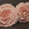
I think your site is gorgeous - I really LOVE that rose cupcake with the glitter pic. The only thing that stands out to me is that sugarsugar: Cakes and cookies for lovers and sinners. Because your business name is in lower case, it seems that it would look better visually to be - sugarsugar: cakes and cookies for lovers and sinners.
Mensch we agree again . . NO music ! it was just a figure of speech... something slighly more interactive would be lovely, like being able to click to view bigger pictures, but NO to music lol

Quote by @%username% on %date%
%body%