


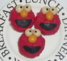
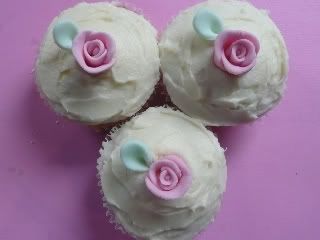
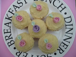
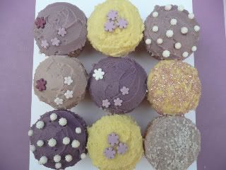
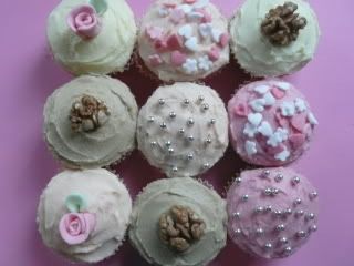
Hu guys, the links below are what i spent my weekend doing! I took the pictures for my portfolio and would be interested to know what you think. im very critical of my own work and can see so many flaws!
http://i241.photobucket.com/albums/ff89/jackandcathy/cakes/P1000526.jpg
http://i241.photobucket.com/albums/ff89/jackandcathy/cakes/P1000472.jpg
http://i241.photobucket.com/albums/ff89/jackandcathy/cakes/P1000475.jpg
http://i241.photobucket.com/albums/ff89/jackandcathy/cakes/P1000477.jpg
http://i241.photobucket.com/albums/ff89/jackandcathy/cakes/P1000482.jpg
http://i241.photobucket.com/albums/ff89/jackandcathy/cakes/P1000483.jpg
http://i241.photobucket.com/albums/ff89/jackandcathy/cakes/P1000488.jpg
http://i241.photobucket.com/albums/ff89/jackandcathy/cakes/P1000489.jpg
http://i241.photobucket.com/albums/ff89/jackandcathy/cakes/P1000471.jpg

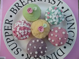
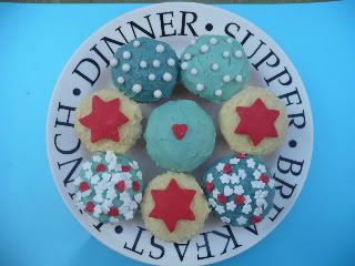
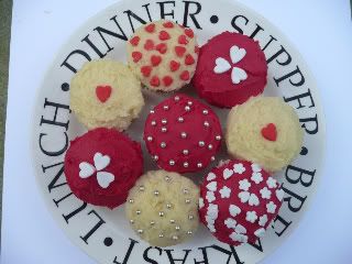
Very nice indeed, and IMO you should stick to photographing your cupaakes with a neutral/ matching toned background instead of the plate. As much as I love that crockery series, the wording is just a bit distracting from your gorgeous cupcakes.

They all came out so great!!!! I especially love the Elmo one. Flawless! The plate you displayed them on is too cute.


Congratulations, your work is really attractive and well presented. I too think they would look better on a plain contrasting backgound as the plate with words on distracted the eye from the cupcakes. I am a novice myself and am experimenting with different coloured materials as a backdrop to my cakes when photographing them as portfolio evidence.
thanks everyone, i few people have said to me about the plates. i was just trying some things out. its so hard to get them looking like they do in real life, i had to take all the pictures outside to get the right light - im sure my neighbours think im crazy organising cupcakes on my patio - lol. think the coloured backgrounds do look best.

They are all beautiful and I especially love the roses. ![]()
Quote by @%username% on %date%
%body%