


Do You See Any Problems With My New Website???
Decorating By peacockplace Updated 19 Mar 2008 , 12:49pm by peacockplace

I posted this in the business forum right before the crash. I just made a new website and I really want some opinions on it. First, what kind of image do you think it portrays? I'm going for an upscale (not snooty, just nice) modern kind of vibe? Do think it works?
Second, since this is a flash site I really want to make sure it works for everyone. Please let me know how it worked for you especially if you have dial up! www.poshpastry.com

Thank you for taking time to look at it! Just wondering, do you have dial up or high speed?


Thank you all! I am trying to get it right. I want to make sure it works as well as possible.

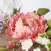
Yeah, yeah - your website is great - Big Deal! The Big Deal is your amazing cakes! I didn't realize so many of those came from 1 person - you are really talented and I think you have some great photos to show your work. Anyone would be impressed if they visit your website.
I am curious though about how people with dial-up can view a Flash website - they really are cool. Nice job!
Tammi
On your menu page the text over-flows past the content box and I agree with ccr03 about the content.. it's harder to figure out what exactly you are offering. Something more streamlined might work better. When you list out your prices you should do it in $x.xx format.. it's easier to pick out of the text that way. Seeing "our prices start at four dollars" it all blends together, but when it says "our prices start at $4.00" it's easier to pick out the dollar amount. Other than that it looks great. I like the flash sties a lot. Where did you get yoru template from? Or did you do it yourself?
Blue and brown are my company colors too.. so of course I love that!! ![]()

Oh my gosh, your website is wonderful!
Very professional and polished, without being "stuffy". Easy to navigate, and I like the blue/brown color scheme.
I have highspeed internet, and the Flash played just fine.
You must be a desktop publisher in another life? When I'm ready to start my biz website, could I get some pointers from you? lol
Kudos to you all around, your cakes are beautiful, and your site showcases them perfectly!
~ Scott
Yeah, yeah - your website is great - Bid Deal! The Big Deal is your amazing cakes! I didn't realize so many of those came from 1 person - you are really talented and I think you have some great photos to show yoru work. Anyone would be impressed if they visit your website.
I am curious though about how people with dial-up can view a Flash website - they really are cool. Nice job!
Tammi
![]() Thanks.... now if you could only teach me to pipe those beautiful designs like you!! I can't pipe worth a darn.
Thanks.... now if you could only teach me to pipe those beautiful designs like you!! I can't pipe worth a darn.

I like the colors, the simplicity, and of course the cakes, I think it looks a little bit unfinished for my taste, frames around the photos, and one frame under the thumbnails might help.
Also your logo should keep it's shape, it's square at the home page, and rectangular at the gallery.
Little details, but it's looking great.
jkalman, Thanks so much... $4.00 does stand out much better. I was actually going to ask if anyone noticed how much I charged. I guess is would work better if I changed it. I'll go do that now.
Yes.. I saw that too.. if you kept it rectangular.. you wouldn't have to scroll down on the opening page to be able to click on the ENTER SITE button too.
I do really like the site though.. it's similar to what I have in mind for my own site.

I think the site is beautiful! I LOVE the colors! I actually like the fact that you don't have borders on your photos...I think it gives a more open feel.
I had a problem with the menu scroll as well. I have cable internet and I am using Mozilla Firefox...I don't know if that makes a difference? I too think there is a little too much detail for your menu...and I didn't see prices. IF you are an actual bakery then you can list those.
I think this is a very nice, elegant site...let us know when you make improvements because I am keeping this one in my favorites! ![]()

i love your site. it's elegant but not in an in-your-face-we're-high-end way. it's very calming too. i could sit here and watch the animation for hours... mmm... cake...
your cakes are beautiful! Oh, and the website was really nice too. I really like the website also. I think it is very elegant. Love the colors. I don't suppose you would share how you did the spiderman cake? My son saw it and wants that for his 5th birthday, which is next month. I haven't done a cake like that before.
Amanda
It was my son's cake also. I found the directions here on CC some where. Do a search for spiderman cake and see if you can find them. If not, let me know and I'll try to see if I can find them.


just noticed... it says on the details page "wedding cakes start at $400 per serving...". im sure you didnt mean that. ![]()
![]() Wow.. now THAT'S making sure you get paid for your cakes..
Wow.. now THAT'S making sure you get paid for your cakes.. ![]()
ya i think thats the most 'spensive cake ive ever seen! make sure you change that, or u wont have any customers!

Your website is simply gourgeous! Simple and to the point. I was wondering who you are using to host your site or if you are doing it yourself. I am in the process of designing mine and I am so frustrated!

just noticed... it says on the details page "wedding cakes start at $400 per serving...". im sure you didnt mean that.
Of course I meant that... don't you think my cakes are worth it? ![]()
Actually, there was a decimal there but with that font it's hard to tell. I went back and increased the the size of the decimal. Will you check back and see if it's easier to see now?
Thanks so much!
I really like the site. The only thing I would do is check the spelling. I think "I absolutly.." is misspelled? I love the pictures not having a border...it adds so much effectiveness to the site..LOVE it.
I'll go and check. I just cut and pasted from the bride's email so I didn't spell check it. 
yes its better.
Thank you! I'm so glad that I can count on CCrs to help when needed. You guys are the best!

Shadow is right, there are a few spelling and grammatical errors. They are very minor, but I noticed them because I am a secretary and that is my job. Most people would just look at your beautiful cakes and be amazed!
I like the descriptions in the menu section, it makes me want some of your cake, now! I wonder if you should list more specific prices in this section. When I am thinking about buying something I want to be able to compare prices. When the price appears vague, I think it might be too expensive for me. But that is just my opinion.
Overall, your website is very nice. I love the slideshow. I know it was a lot of work and you did a great job. Good luck with your business!
Quote by @%username% on %date%
%body%