To Add, Or Not To Add? That Is The Question...

Decorating By pish Updated 5 Oct 2007 , 12:21am by ShortcakesSweets

pish Cake Central Cake Decorator Profile
pish Posted 4 Oct 2007 , 10:29pm
post #1 of 12

So I just finished the cake below for a companies fifth anniversary. I'm not sure whether or not the top needs "something" or whether it looks fine as is.

I don't want it to look too busy but I'm not sure about all the negative space on top. Any and all suggestions would be greatly appreciated! icon_biggrin.gif

Thanks
LL

11 replies
Postal_Cakemaker Cake Central Cake Decorator Profile
Postal_Cakemaker Posted 4 Oct 2007 , 10:33pm
post #2 of 12

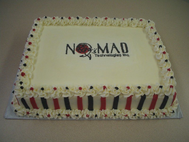
Does the company have a slogan or anything like that??

You could incorporate that possibly??

Just a thought.

Maureen1954 Cake Central Cake Decorator Profile
Maureen1954 Posted 4 Oct 2007 , 10:36pm
post #3 of 12

You could put a smaller border around the logo.

mccorda Cake Central Cake Decorator Profile
mccorda Posted 4 Oct 2007 , 10:37pm
post #4 of 12

It looks great! Doesn't need anything more on top. Anything more might take away from the logo.

indydebi Cake Central Cake Decorator Profile
indydebi Posted 4 Oct 2007 , 10:37pm
post #5 of 12

It looks perfect! Very "understated elegance"! I wouldn't do a thing to it.

When putting together a brochure or any sales literature, it is very important element to have plenty of white space to balance.

Momkiksbutt Cake Central Cake Decorator Profile
Momkiksbutt Posted 4 Oct 2007 , 10:38pm
post #6 of 12

What is that symbol in the lettering on the cake? Maybe you could make a corners border out of that?

EmilyGrace Cake Central Cake Decorator Profile
EmilyGrace Posted 4 Oct 2007 , 10:38pm
post #7 of 12

I like it just the way it is... but you could add a border around the name or maybe write "Happy 5th Aniversary"? Not sure if that would be cheesy or not! icon_smile.gif

cakenutz Cake Central Cake Decorator Profile
cakenutz Posted 4 Oct 2007 , 10:39pm
post #8 of 12

Looks perfect to me I wouldn't add anything. thumbs_up.gif

kaseynh Cake Central Cake Decorator Profile
kaseynh Posted 4 Oct 2007 , 10:46pm
post #9 of 12
Quote:
Originally Posted by indydebi

It looks perfect! Very "understated elegance"! I wouldn't do a thing to it.

When putting together a brochure or any sales literature, it is very important element to have plenty of white space to balance.


I agree, any more added would take away from the company's logo!

ncbert Cake Central Cake Decorator Profile
ncbert Posted 4 Oct 2007 , 10:57pm
post #10 of 12

Looks great as is! I think simple is better,as not to take away from their logo.

leave as is thumbs_up.gif

pish Cake Central Cake Decorator Profile
pish Posted 5 Oct 2007 , 12:19am
post #11 of 12

WOW! You guys are fast. Thanks for all the great responses! I think I'm going to leave well enough alone and keep it as is. One, the more I look at it the better I like it and two, I'm too pooped to do anything else to it icon_lol.gif . Thanks again

ShortcakesSweets Cake Central Cake Decorator Profile
ShortcakesSweets Posted 5 Oct 2007 , 12:21am
post #12 of 12
Quote:
Originally Posted by Maureen1954

You could put a smaller border around the logo.


I agree. I think it would highlight the logo.

Quote by @%username% on %date%

%body%