


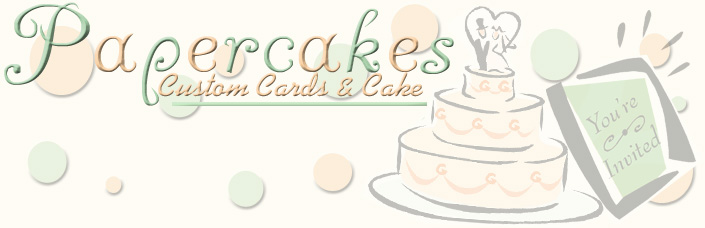
After making 13 (yes 13!) of these suckers in the last 3 hours, I have it narrowed down to two different logos and can't decide.
The first one I like, but it covers up the "You're Invited" on the front of the card and i'm not sure if you can really tell it's an invitation then.
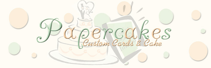
The second one I like and the layout looks good w/ the way my website is set up, but the centered one just catches my eye differently.
I'm also not sure how I feel about the green underline either.
Any suggestions?


I think I like the off-centered one better. It looks less cluttered. GREAT design!
I think I like the off-centered one better. It looks less cluttered. GREAT design!

You know, I have been sitting here looking at both of these cards for at least 3 or 4 minutes and I have to go with the second one only because it keeps drawing my eyes to it. It looks very nice in every aspect and although the lettering overlays the cake and card it looks like it is supposed to be that way and is very clear and easy to understand.
So, the centered card gets my vote.
Great job!

first one. i think its too hard to read the second one. they look great!


definately the first design the second is congested and the client just wouldn't get it. The first is clear thet yes you make cards and cakes and it flows nicely the blank space is what draws the flow. The second looks at a quick glance (first impression)that you make cakes from paper. Possibly plural cake to cakes.
Good Luck

I'm on the fence with this one. At first, I liked the off centered one better. It caught my eye because it wasn't symmetrical and looked interesting, and I could read the You're invited. The more I looked at them, the more I thought the centered one looked...I'm not sure what word I'm looking for--professional, elegant, clean???? I agree with everyone else that the You;'re invited part just looks like a green background on that one. The more I look, the more I like the centered one. I can see why you're having a hard time. I can't choose and it's not even my logo! Great job on them!

i agree with mamaberry. i like the first one with with the graphic first. it helps draw the eye to what you're actually advertising for.

My vote is for the off-centered one. You can see your pictures clearly and it makes sense.
On the second one you don't know what is behind the words so much. You know a cake is there but what is the other one (without you telling us what it is, of course). HTH


I like the first on the best! I like how you can see everything and your name is off centered. Looks interesting.
Just an idea...haven't seen if anyone said it yet.
Maybe, if you move the "Papercakes" down just a tad it might be more appealing to your eye...for you I mean. Then it wouldn't be to the tippy top of the page and you might like it more! (this is partly my husband's fault for making me so picky on composition! LOL)
I agree with the above, I like the first one, but the first thing you see is Papercakes, then you really have to read what the rest says. I think that maybe you might want to see what it looks like if you move down the " custom cards and cakes" or even put it as custom cakes and cards' what is it that you do more of? Whatever you do most of, put that first.
When I posted the same request as you a few days back, someone reminded me, that your potential clients will read it for 2 seconds, so what can you read in 2 sec.
Love the colors, you have done a great job... what program did you use?
Good Luck

I can't decide on which one is better, but the colored dots in the background make them both difficult to read, way too busy for me. They are cute though!

I think they are cute but I realy don't care  for either... I think they are too busy for a Logo. For a business card they are perfect... but a logo should be simple and eye catching, it is your brand (like how cows are branded... hot permanent stamp... easy to recognize)
mpc

I like the first one but take out the underline. JMHO.

I like both of them.
~ #11 continues to catch my eye every time I look at them both.
~ #12 is nice & clean and the invitation is seen easily.
Both are beautiful!
Here's the "but" ~ After I looked at both several times as I was reading all the posts, it wasn't until I got to the very end that I realized part of your business is "invitations". vrmcc1's comment is what made me realize there were cards involved because I went back to see what the peach color said. Of course, I'm on a cake site and my mind is on cakes ![]() . I thought the invitation had something to do with you inviting folks to come and check out your cakes
. I thought the invitation had something to do with you inviting folks to come and check out your cakes ![]() . And I thought "Papercakes" is a very neat and unique name. Of course, if I had read the"Custom cards and cake" part, maybe I would have caught the idea better. "Sorry, I don't catch on to things easily
. And I thought "Papercakes" is a very neat and unique name. Of course, if I had read the"Custom cards and cake" part, maybe I would have caught the idea better. "Sorry, I don't catch on to things easily ![]() . So maybe the peach could be a different color or maybe a little darker.
. So maybe the peach could be a different color or maybe a little darker.
Also, do you want it to read "Custom cards and cake" or Custom cards and cakes"?
Again, both are beautiful! Based on the type of your business, my vote would be #12. 
Quote by @%username% on %date%
%body%