


I'm not posting this so I can get a bunch of you to tell me how cute the cake is. I am posting it becasue I want to learn and need some constuctive critisim (sp). ANyway, in my head this cake was adorable. I think I did a fair job on it but I just think there is something missing. Something that would make it more of a wow. Do you know what I mean? I would really be interested in your ideas. Is it becaue I used buttercream (meringue based)? Should I have colored it? Ideas??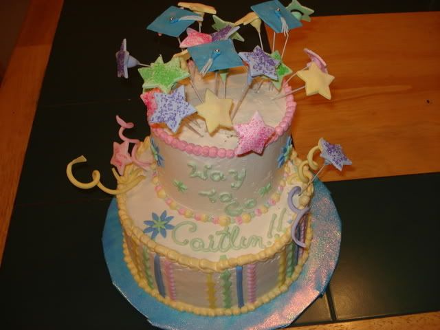

It took me a little bit to figure out what might have helped it. (I am no expert by any means, this is just my opinion.) It seems that you have a lot of yellow. The fosting has a yellow tint and you decorated the bottom layer with more yellow then the other colors. The blue flower really "pops" out on the cake. Maybe you needed more contrast. All of the colors that you used were pastels and kinda of all blend together. For example, the bottom layer's border is yellow and blends into the frosting. Maybe the blue would have been a better choice for the border.
HTH ![]()

add more blue flowers an maybe some pink flowers and cover some of the stripes on the bottom tier to add more color
Yes, I see what you mean. I also think the the writting should have been in blue (it's actually violet). The frosting is pretty white that tint is from the photo, but you are right about too much yellow.
Cover the strips??
Thx for the feedback you guys.
yeah cover some of the srtipes on the bottom tier with some more flowers placed casually around to add extra color

It is a super-cute cake btw! ![]()
I think more color contrast would be nice as well.
Possibly vary the length of the "poppy outty?" things sticking out of the tiers. At least from the photo they all look to be sitting at about the same height from the cake.
What about curving some of those wires so they're hanging over and to the sides of the top tier a little?
Some more of those blue flowers on the bottom tier, maybe on the board as well?

My first thought was everything is pastels. I think the blue flowers really stand out. I also agree with varying the height of the wires and bending some.
The cake does look good btw!

the colors dont seem to fit the occassion. the cake seems off becasue it is a graduation cake and has baby shower colors ![]() maybe thats what you mean by something missing. I really like the design and the structure!
maybe thats what you mean by something missing. I really like the design and the structure! 

i agree that the colors do look like a baby shower cake. maybe if you used school colors or something. maybe put the school letters or mascot would have made it look like graduation cake.

I like the pastel colors but then when I took a 2nd look I noticed the caps and thought "Oh this is a graduation cake and not a baby shower"
I think I would add a few caps on the sides or the year so it's more like a graduation cake.
Other then that, I like it a lot.
Thanks for the feedback everyone. The mom asked for a girly cake with pink. I guess I could have done more vibrant colors but for some reason I got pastel in my head. The wires were different heights but i suspose bending some over the side would have been good. I just get so nervous when I add the final touches I think sometimes I play it safe.
And the funny thing is one of the moms comments was that she loved how I wrote "way to go" on the side of the cake ![]()
I think deeper colors and more contrast is the answer to this cake. I'm learning alot with every cake I do and I apprediate everyones input because without this site I don't think I'd be as far as I am.
I gave her a box of cake balls as a thank-you. They loved that!!

Quote by @%username% on %date%
%body%