


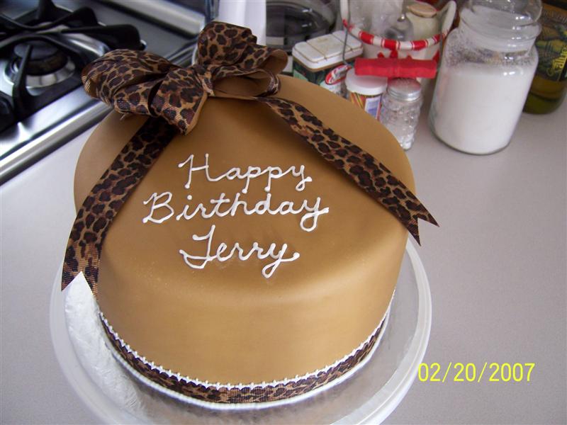
No, I think it would disappear into the background. You might try painting over it with ivory, to blend better with the featured colors. Use some Americolor Ivory with some clear lemon extract.
Theresa ![]()


Ooh sure! That would be very cool!
Super looking cake!

It looks finished to me! I always over-do my cakes, so speaking from experience, leave it the way it is! If you do decide to do the luster dust, post a picture though, I'm sure it will be great either way.

I vote to color it something other than white, the white is awfully stark against the softness of the cake colors. Experiment, pipe a bit of white icing onto a piece of waxed or parchment paper in three lines, let it set up and then try brushing one line with copper, one with gold and one with silver. See if they appeal to you, hold them next to your cake to see how they blend.


I'd leave it just as is, it looks great! ![]()

I think it would be fine to use copper but I think it should be brushed on dry, not painted.


I think it's beautiful just as you have it. It's very simple, but elegant. I always think my cakes need just a little something extra, and then I end up disliking them. ![]()

I would say through the eyes of a graphic designer, not a professional cake decorator, adding gold/copper colour to the white writing would make it disappear because the cake itself is already that tone. The writing would be hard to read. It looks great the way it is. As was said, for contrast to make the writing compliment the border is a nice idea ![]()

I wouldn't change a thing. It looks good to me.


Thanks everyone for your help. Unfortunately, I wasn't able to keep the cake as is as I decided to. My 2 yr old son stuck two fingers into the side of the cake. I tried to patch it up but I couldn't get the right color. I had to add some medallions to it to cover up the holes. I can honestly say I HATED the cake with them on there but all I had was about 30 mins to fix it. Please tell me it's not a complete disaster.![]()
![]() Kids.
Kids.


Maybe you could use the luster dust on them to blend the medallions in a little?

I completely agree with kimmy37, I really think you should keep it white to match with the white in the border in the ribbon, more appealing to the eye IMO.
DITTO, painting with copper would really darken it too much, it wouldnt stand out from the brown underneath.

I vote to leave it as is. Very pretty. Less is more.

I like the lettering white, but I would dust the medallions with a little copper. It is still a very pretty cake.
Quote by @%username% on %date%
%body%