


Well, I finally set up my own website. (Or maybe I should say my DD set it up for me. LOL) I was hoping for some feedback & critiques if you guys get a chance.
http://www.wix.com/sebrinareese/absolutelycake
TIA!

Three quick comments:
1. There's a typo on the flavors page.
2. I hate that lime green background. Too harsh on the eyes.
3. That Comic Sans font is so overdone and also gives the site a more juvenile look.
But otherwise, it functions well and shows your stuff. Great job!
Edited to specify:
typos -- last paragraph "waht" should be "what"
Peanutbutter should be two words -- Peanut Butter

Your site requires a Flash Player, which isn't available on many cell phones with a web browser. (I am on my cell and I couldn't view your site.) You may want to rethink this feature so that people who are on their phones can view your page. Just a thought...
Oh, and another thing...
You've got quite a few cakes with copyrighted characters on them. Not a good idea to have them on your website if you haven't gotten permission to use them.
Do a search on CC for "copyright" and you'll finds shloads of info about using copyrighted characters, logos, etc.
IndyDeb just posted a thread a day or two ago about branding, logo and how if its done right it pulls in the right customer and if its not done right it brings in the lowballers. Just from first glance I wouldn't expect to pay over $150 for any cake based on the impression I got from your site. It seems to me like one of those links you get from Craigslist. Your work is good, maybe consider actually paying for a web designer even if DH thinks he is professional. I think a web site speaks tons to your business.
Hope thats not harsh...not trying to be mean but honest feedback is more helpful in this situation

I agree with the others that said the green background is too harsh. Something softer would make it easier to see. Also, on the first page you have words over your photo, which makes them hard to read because the contrast changes depending on which part of the photo it's over. I think the gallery would be better if people didn't have to scroll through the photos and could just see them all at once. Personally, unless I was really interested, I wouldn't sit and scroll through a ton of photos.
Finally, I would probably pay for a professional website. You can get stuff hosted through godaddy for fairly cheap and if you use a professional to create it you will look more professional by association. When I see a free website (and it announces that it's free on your page) I assume that the business isn't very serious. I would think that if you're using a free website your cakes must be cheap and I don't think you're looking to be making cheap cakes. I'd also never remember your website because it's not just absolutelycake.com. You want people to remember your website so they can tell their friends.
ETA: I forgot to add one thing. If that line at the bottom of the first page about not being subject to the same food safety regulations is required then I suppose you have to leave it (though if you can reword it I definitely would). If it's not take it down. That would immediately turn me off because it makes it sound like you don't have to be clean or sanitary and that would gross me out as a potential client.
I've never seen scrolling pics like that, very interesting. Maybe a softer, minty-er green? And a more flowing script?
On a side note, I adore the cake with the pink fondant flower that you've "stitched". Looks like a felt flower, and it's the cutest thing!

I agree about the green- a little harsh. Your cakes are very nice, and the gallery effect is very interesting.
On the flavors page, the three vertical cakes on the right in the the collage all seem to run together. If you could use a colored border around each picture, that might help to set them off.
Good luck with your business.
You have to go to the contact us page to find out where you are.
I'm not sure I understand the "it's absolutely cake" tag line as the feature of your front page. If all your cakes looked like other objects, I would understand, but they don't.
These are nice pictures, but there are no "selling words". "Luscious Chocolate Fudge" as an icing flavor, rather than "chocolate", IOW.
I know it's considered fluff, but I like to read about the baker and his/her philosophy. Do you use all natural ingredients? (We all do, but it sounds good).
I would suggest more marketing aspects. Why should I order a cake from you? If we were sitting down face-to-face, how would you answer that question? A website takes the place of in-person. Think of all the questions you would ask if you were doing the buying and what would make you choose one vendor over another?
I too, would lose the part about the FL cottage law, unless you have to have it.

I actually like the lime green and blue combo - your cakes look great - the photo on the main page is kind of buried under the lettering - I don't love the picture scrolling thing - doesn't really do them justice or something.
On a side note, I paid a professional $800 to create my logo and website and yours is 5 times better than my final produc - so lesson learned there, make sure you do your homework before hiring someone - ask to see a portfolio and testimonials. Also make sure you are clear with how things are going to work for maintaining the site and get it in a contract.
Your site requires a Flash Player, which isn't available on many cell phones with a web browser. (I am on my cell and I couldn't view your site.) You may want to rethink this feature so that people who are on their phones can view your page. Just a thought...
A big +1... I cant see your website on my iPad. If i was a potential customer, you just lost me because i cant see your website.
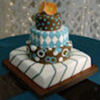
WOW! After reading the above posts, I was expecting some awful cakes. But your work is very good. The only one that I would remove is the green one with Happy Birthday on it because the letters aren't uniform.
other that that, I don't see what some others are seeing. And the green came out great on my Mac.
Congrats!

I concur that the lime green background is a bit harsh on the eyes. I understand what you are trying to do with the tagline. However, I also don't think it produces the effect you are looking for. I don't think your average client is going to question the image. Or look at and as say wow is that cake?
That is not slight on your skills, which I think are quite good. Rather it is a comment about the common knowledge your potential customers will come to your site with. They won't be looking to be surprised or not have an idea about specialty cakes--which is what the tagline intimates.

What' with all the hate?

I like it ... a lot, green too!

The cottage food comment is mandatory, I'd think!
Actually, FL doesn't currently have a cottage law, unless it passed this week, so I don't think it's mandatory.
Unfortunately I agree with the others, I have a hard time looking at computer screens in general, and the lime green almost gave me a headache.
cottage bill (sb 81) just passed in tx. don't know how many other states are covered by this. assumed since she posted it, she knew what she was doing. maybe if it's pending, she's planning ahead.
on the green background color, change it according to your own preferences. what everyone else thinks is secondary and not going to reflect your personal choices. maybe there are peep who have marketing degrees etc, but don't forget to let it reflect who you are as a cake artist.

What' with all the hate?
OP asked for OPINIONS and input, not "make me feel better about this" strokes. No one said anything ugly, and just posted opinions about how they perceived the site, as asked....
Please don't turn it into anything ugly for the people who took the time to offer some great suggestions. If you disagree, feel free to post your opinions as well.... just don't call the other posters "haters". ![]()

I have to agree with the "no comic sans" comment. I have had two separate conversations this week, with people who know about graphic design, about how overused that font is. But I was wondering why you don't use the same font that your business name is written in. I think it's distinctive and classy and would be easily readable for the other text on the page. Plus using the same font throughout the page makes it more uniform. It gives it a business image.
On a side note, I like the picture scrolling feature and I don't see why it's such a big deal to click on the "contact us" link to find out where you are. The green also doesn't bother me, but I can see how it would seem harsh to some people. Is there any way you could add "texture" over the background to add interest?

What' with all the hate?
OP asked for OPINIONS and input, not "make me feel better about this" strokes. No one said anything ugly, and just posted opinions about how they perceived the site, as asked....
Please don't turn it into anything ugly for the people who took the time to offer some great suggestions. If you disagree, feel free to post your opinions as well.... just don't call the other posters "haters".
She IS capable of turning out some nice cakes and thought that she might be looking for validation on the work she put together. Creatitvity abounds and it is HER personal style and work. (Know how you sometimes might just want to hear someone else just say what you already know?... probably not.) Not everyone is overflowing with confidence. It also appeared that from some earlier comments that were being offered that her work might be horrible. From where I'm sitting, her work was nice.
I personally loved it. Thanks for your blessing in stating my opinion, however I don't need the validation. ![]()
Quote by @%username% on %date%
%body%