


I just finished my website for my decorating classes. can anyone give me some feed-back?
www.baker-chick.com

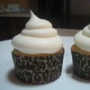
Some are mine from when i took the classes and some are students cakes

I like the colours - it looks very fresh. The information is good and I just have a few small comments:
Usability - I would choose a darker colour for the links in the left frame. They are a bit hard to read right now. And a large size for the text. Also the logo could be a bit larger.
Marketing - I would consider not mentioning that you are not a master ![]() I think thats to humble and you shold put the emphasis on what you can teach anyone attending the classes instead.
I think thats to humble and you shold put the emphasis on what you can teach anyone attending the classes instead.
Consider putting the price and the info about extra cost for on a page of it's own. The first page should be interesting and appealing and only have positive information.
All of the above only said to help( I work with usability and websites for a large global company) and sorry for my bad english
thanks egensinnig. ![]()
i made some changes. i think this will help. let me know what all of your thoughts are.


I think it looks good - just don't forget that the tuition is going up to $40 in January at HL. (I also teach at HL). =o)
i got an update/newsletter that the tuition won't go up till June.
IMPORTANT NEWS: As a result of a recent meeting with Hobby Lobby corporate, the decision has been made to delay raising tuition until June 2010. Please update your Sign up book and flyers to reflect this change. Tuition will continue to be $35.00 (thats $17.50 with the 50% off promotion) through May 2010.

I too like the color you did a very nice job everything detailed. 


Quote by @%username% on %date%
%body%