

I've been asked to do a cake to match this party theme:
http://www.etsy.com/view_listing.php?listing_id=20656461
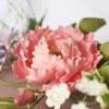
Super cute and I'm really excited about it, but how do I make my colors like that? They seem to be muted primaries. I can't just add less of a red or green or orange because then I'll get pink or mint green or peach. How do I achieve the same color depth with a sort of 'faded' finish? Any thoughts? Thanks!! ![]()
~Sarah

They don't look primary to me... could just be the difference in our screens/computers? If I were going off of that picture, I'd use a "rose/blush" for the pinker shade, a light shade of "buttercup" for the pale yellow, "shy blue" for the blue and maybe a light "forest" green with a touch of ivory in it. Just my opinion! ![]() )
)
They are actually described as primary in the product description...I think basically they are but it's supposed to look sort of 'vintage" so everything has a slightly muted tone to it. Just trying to figure out how I'm going to make these "faded" out colors. Hmm... ![]()
~Sarah


I would make the primary colours up and then add additional white past to take the "bright" off of them, just knead through a little at a time.
Add a little bit of their complimentary colors to them... a little red to the green... a little green to the red... a little orange to the blue.. a teeny bit of purple to the yellow (teeny)... etc. This will grey them up a tinge and then add some white to lighten them up a few shades. Is there anyway they can get you one of the invites?
Quote by @%username% on %date%
%body%