


This Tier Needs Something But What?
Decorating By shalderman Updated 22 Jun 2008 , 10:04am by gottabakenow
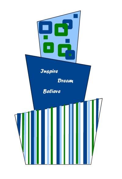
I'm making this cake for my cousin's DH's grad cake. Its based off the invites that used these colors and the stripes. I have yet to decide if the square decored tier will be in the middle or the top. The dark blue tier will have white fondant letters on it to spell those words but they will be placed nicely around the cake - not all on one side like pictured.
So my ? - I want to add SOMETHING else to the words tier but I can't figure out what? Oh and there will be a fondant ball border around in all of the colors - around each tier.
Any ideas? Since its for a guy I was shying away from flowers...we want it retro kind of funky/modern...

i agree, it will look great with the pearl border. don't add anything, it would look too busy, IMHO.


I like things on wires. Like blue and green stars sticking out would be so cute.

I agree maybe some stars sticking out would be nice....
If you don't mind me asking - what program did you use to make that?
I agree, less is more, but if you want to add some extra stuff I would make little gumpaste rolled up paper (scrolls) on wires all around the middle tire.
don't forget to tie the scroll with blue ribbon to tie it all in with the color scheme

i like simple. i think your sketch is good- and that the plain blue cake is placed in the middle is good. it breaks up the pattern so the eye isnt too confused. i personally would NOT add the ball/pearl border, i think simple without borders looks much cleaner. too many patterns or textures makes it too busy. the stripes and squares seem just enough without overdoing it. dont forget the fact that you are also carving the bottoms of the tiers, which also in itself, lends visual interest.

At first I was thinking, maybe dots. But I think once you get the letters bigger and spread out more you will find you are taking up more of that tier than it looks like right now. And I do think it does give you a break in the business and would make the other two tiers stand out.
Instead of a ball border, why not a simple rope border? Or even as someone else suggested a twisted rope. It will cover up rough edges if you have them, and they blend more into the cake and not stand up.


additional words you can use if you end up with room...
live love laugh play
Great cake!
additional words you can use if you end up with room...
live love laugh play
Great cake!

personally, I think that the middle tier has more impact the way it is. Since you want to emphasize those words, having them on that dark blue is very nice, stands out, and keeping it simple will draw the eye to the words, while the designs on the other tiers contrast nicely and make the whole thing fun and funky.
I love it! Can't wait to see the real thing! ![]()

are you asking should you move the middle tier as the top and should you add anything else to the middle (blue) tier? i agree to leave the blue in the middle and i wouldn't add too many words, i like the solid contrast. as for adding something else, what about a fondant 2008 in rope numbers? just white, simple? i can't wait to see the finished product-and how do you plan that out like that?
Wow - thanks everyone for your great suggestions!
I'll likely stick to those 3 words as that is what was printed on the party invite (and what she requested). She does want me to put Congrats Nick but I think I'll do that on the actual cake board with the tappits.
After reading all your replies I do think it might be best to have it just plain (just words). The words will be larger than shown. My sister had initially been helping me figure out the design and she thinks we should do wires out the top with fondant balls on the ends to coordinate. I'm going to run the twisted rope border by her as a fondant ball alternative. If my fondant goes perfect then I don't mind no border ![]() but sometimes... well
but sometimes... well ![]() things don't go so perfect LOL
things don't go so perfect LOL
And for the person that asked I did the image in Paint Shop Pro. Normally I just sketch on paper but I wanted to see the white words on the blue and I wanted to easily switch colors around.
Anyway thank you all for your help! I appreciate it...I'll be decorating on Fri so if anyone has any bright ideas feel free to post yet ![]()
Steph
Wanted to thank you all again for your help - here is the finished cake! ![]()
http://www.cakecentral.com/modules.php?name=gallery&file=displayimage&pid=1235393
Steph
great cake design and I really like the colors, I don't think it needs anything either.
if you want to bring more detail to the middle tier maybe do small piped dots. but nothing too busy.
that's what i think too...small piped dots either single or in threes. 
oh...btw...how'd you do that???...the drawing???
I did it up in Paint Shop Pro....like PhotoShop but cheaper. ![]()
wow that's awesome! i love seeing how it looks from the drawing to the cake, and you did it exactly!
Quote by @%username% on %date%
%body%