


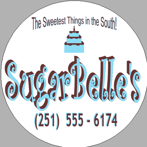
Can't sleep, so I've been working on my graphic for my business. I had one that I liked...which sooo many CC members helped me with, but my computer crashed a little before Christmas and I lost it ![]() So I needed to work up another one. Though my business name is SugarBelle's, I didn't go with a "sweet southern belle" girl holding a cake, like last time. I decided to just keep it simple for time's sake...I need some cards and stickers quick! lol And I needed to do something that would communicate that I did cakes and sweets, more specifically. My tag line is "The Sweetest Things in the South!"...but as a few of you pointed out, SugarBelle's could easily be a children's clothing line or something other than cakes, etc. and I agree. Couldn't seem to come up with a tag line I liked better, so I thought of just putting a pic of a cake in it...duh!? lol The colors are aqua and brown...inspired by a lot of cakes I've seen recently, actually. The pic below is my sticker to put on cake boxes, the back of wrapped cookies, etc. , but the biz cards are very similar. Please tell me what ya'll think....good & bad! Thanks for looking
So I needed to work up another one. Though my business name is SugarBelle's, I didn't go with a "sweet southern belle" girl holding a cake, like last time. I decided to just keep it simple for time's sake...I need some cards and stickers quick! lol And I needed to do something that would communicate that I did cakes and sweets, more specifically. My tag line is "The Sweetest Things in the South!"...but as a few of you pointed out, SugarBelle's could easily be a children's clothing line or something other than cakes, etc. and I agree. Couldn't seem to come up with a tag line I liked better, so I thought of just putting a pic of a cake in it...duh!? lol The colors are aqua and brown...inspired by a lot of cakes I've seen recently, actually. The pic below is my sticker to put on cake boxes, the back of wrapped cookies, etc. , but the biz cards are very similar. Please tell me what ya'll think....good & bad! Thanks for looking ![]()
*edited because I forgot to change my phone # before I posted it ![]()

Just was looking at it again...what if you moved the cake up to the top, wrote Sugar Belle's under neath of it, then smaller underneath that wrote your tag line, and then under that, your pphone number?
I think it might lookl better than with the tag line on the top (?) Just a suggestion.
Cake Pic (same as is)
Sugar Belle's (same as is)
Tag line (written smaller font and w/o ! and capitals)
Phone Number (as is)
And what about "The sweetest treats in the South" instead of "things"? so you are a little more specific?

Jenn--I really like the newest version!! I don't think it is too small to read, but if you are concerned you could make it all brown (perhaps underlined in turquoise?), or leave it two-toned and go up just one size (it looks like the next size bigger font would fit?). I think on the computer screen it looks a little different than when it will be printed because the turquoise won't be as bright, and it will meld together a little more. edited to add: so maybe that smaller size is ok. Have you tried printing it to see how it would look?
I really like the uniformity of the second design! I think it looks great!

I also really the second design. And I love the colors.
Thanks pinkbunny & cande! Uniformity is exactly what it was lacking. I really appreciate what you pointed out, cande. I haven't printed any yet...think I'll just print one onto plain paper first, so I don't waste a sticker, to see if the tag line is too small or difficult to read. I may just reverse the colors on it...we'll see. I really appreciate the input from all of you! And I'll post a verdict after I print a test copy...lol. THANKS! ![]()
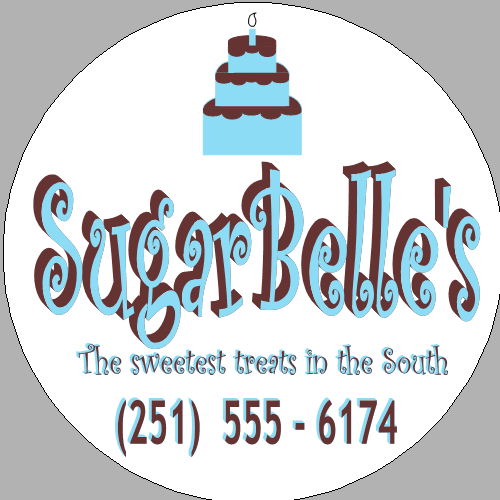


I like the last one you post the best. Good luck!!

Have you checked how it will render in:
1) greyscale
2) black and white
If you ever advertise in newspaper or simliar, your ad will most likely be either greyscale or b/w.
So, often what looks good in color, straight off an inkjet, fails miserably in greyscale or b/w. Some parts might even not reproduce at all.
(many years of yearbook, newspaper advising and doing the advertising for HS plays has taught me this)

I like your revised one with cake on top and name, tagline, etc., on bottom.
I also agree. Use one color for tagline.

I like the 2nd version....very nice.
Make sure you back up your PC! I hate that you have lost your hard work...I know that's a super pain! ![]()
julia

Quote by @%username% on %date%
%body%