


OK, after all day (and just one day's work, on a bit of an ad deadline) I got my "rough draft" of my website up tonight.
Go to www.cakesbystefanie.com and feel free to fine-tooth comb over everything and let me know what I missed. I see a few things I may tweak, but I'm curious what you guys think. Keep in mind, I may completely disregard any changes you request, lol...!
Thanks for any help, just the same! I'm beat...
good night
P.s., yes, everything's legal...


 I thought your site was lovely, elegant and very informative. Everything flowed well and most any question someone might think of you answered. WOW. Your cakes are gorgeous and I think you expressed your self in personal yet professional way. Great job. Oh...I also really liked how you put the price per serving under the wedding cakes that gives a visual idea of what to expect. Again, I think you did a great job.


Your cakes are so pretty, I especially like the Edwardian Wedding Cake. Details are so important and you did a wonderful job! Most of the websites don't give a complete pricing guide, I think its a good idea to let people know what you offer and give them a price. Well done!

Hey homecook ~ your site is beautiful!
One suggestion ~ I would tweak the wedding cake picture on your homepage. I would suggest cropping the picture so that the tiered wedding cake is all you see. Then enlarge it like the ones in your wedding cake gallery. I personally feel it would make a more beautiful presentation and first impression.
I like how viewers can enlarge all your pics for a very close-up view. Your Edwardian Wedding Cake is gorgeous and enlarging it shows off your fabulous detailing!

Went through the whole site and wanted to order a cake from my new best friend. ![]() The only problem I had was losing the words into the background as I read. And honestly, now I'm seeing little lines on this blank page. Don't forget to add a Testimonial Page, or Client's Comments, I don't really know what you would call them, but I'm sure you know what I mean. Your Gallery speaks volumes for expierence. May your business grow and may the joys of many Brides be yours.
The only problem I had was losing the words into the background as I read. And honestly, now I'm seeing little lines on this blank page. Don't forget to add a Testimonial Page, or Client's Comments, I don't really know what you would call them, but I'm sure you know what I mean. Your Gallery speaks volumes for expierence. May your business grow and may the joys of many Brides be yours.
Gloria I

I think you did a really nice job. I love the cakes with the prices listed under them. I think you should that with all the photos.
The only thing I would do if I were you is to add to your home page your phone number and location. That way people will know right away if you are close enough or to far.
Do you charge for delivery? If so you should list that. If you did I didn't see it.
One last thing I would have liked to see is a photo of you. It's nice to have a smiling face to put the cakes to.
Other then that I can't think of a thing to tell you to add.
Joanne

your website looks really nice and pleasing on the eye and your cakes are fab!! One thing i found and no-one else has mentioned it, so whether its just me, when i open the website your top right picture is covering part of the writing, and on the next page your cake prices are mingled in with the rest of the paragraph. There is also the lower link 'entwined' with all the writing. I'm not being picky, its just how its showing when i open the website, otherwise the overall view looks very professional and the set up looks fab! It must have taken a long while to get it all together. Well done! cheers Jan


Your site is great but here are a few suggestions:
On the "About Me" page, second paragraph, delete the sentence about when, where you and your husband met and how you had to move around due to his job; and how you moved back to the area. I think it's a bit much. Also, you already indicate where you currently live at the beginning of paragraph. Then, pick up with your next sentence "When our kids were small...but, change "our" to "my" if you do decide to delete the previous sentence I mentioned. Also, I don't think its necessary to mention how many siblings your husband has so you could delete that part of the sentence and just state you did 3 wedding cakes for family.
One other thing is the text color. I like the green that you use on most of your pages and I think it would be a better color for all the text for easier reading. Or, if you could make the brownish/tan color darker that would be better.
Hope this helps.
Good luck with your business!

Your site looks very professional, and your cakes are gorgeous! Well done! Here are my comments:
In the section "About me":
"Be aware that prices are for basic cakes,
and be prepared to pay extra per serving for...."
I would change "be aware" (sounds like danger is lurking!) to: "Please note...", and change "be prepared..." to "there are additional charges for..." (this sounds softer/more gentle).
In the "Tips for brides" section:
"Here are some tips and things
I've learned in my (albeit brief) experience..."
I would delete "(albeit brief)". No need to scare off any brides; focus on the positives. Change "things" to "ideas" or "information."
"Plan to pay a deposit of $50.00 at this meeting"
They may still be checking out other bakeries and don't want to commit. I would change it to "A deposit is required to hold your date" or something like that. Are you sure you want just $50 for the deposit? Most places (in my area) require a non-refundable 50% deposit. After all, if they cancel, you've turned down other customers. Payment in full within two weeks of the date; this allows a bit of a fudge-factor for those customers who drag their heels.
Just my thoughts. Hope I was helpful. Again, you have a beautiful site!

I love the design and layout of the home pages and other pages but I found the beige color to be a bit bland.Maybe a pastel color like,pink,yellow,turqoise or lavender might be nicer..They say soothing colors draw you in and make you feel at ease.I also found the about me page quite long and extensive..most people will just pass it by.I would make it short but sweet.Your pictures are great and the work speaks for itself as well.I like the site!! Very professional looking!!
Thanks to everyone for all the tips. Seriously, that's what I was needing. I'm going to print out this thread (and a long note from an editor friend of mine, who basically raked me over the coals). I'll do some tweaking and see what it looks like later this week.
Have a great day all! ![]()

i love your site. i agree with the others about the "about me" page, its a bit to much info.
wish i could have a web site like yours. its very nice.
good luck!
melody
okay, i really like your "about me" page. i think the changes are great!!!
thank you for sharing your web page with us....one day maybe i'll have one.
thanks!!!
melody
You did extremely well for a days work! It is a beautiful site - Congratulations. I have two things to suggest: 1) I agree that the picture on your homepage needs to stand out a little bit more ... a lot more. This is your first impression, and you want to WOW the visitor; 2) this is really, really minor - but I noticed that the pretty little teal-colored symbols bump into the text on the Pricing page. Might want to add a space or two.
I'm in the process of making my own site, too. Would it be okay if I pm'd you with a few questions as to how you did a few things? Thank you.
Be sure to keep us posted. I'd like to see the finished product and I'm sure everyone else would too!
I personally like the beige. All in all, your site is beautiful!


Ditto on all the kind suggestions. In following the comment on Watermarking, may I suggest that the cakes be made the center of attention, through cropping and adding a complimentary effect. I did not notice last night, (this a. m.) the backgounds of each picture. However after viewing them again, I noticed that some do have a distracting object or two. I believe, you may have chosen the picture you use on your home page because it is the one that best displays the cake. Sorry to repeat this, and I know it may not matter but I still lose words in the background and I'm seeing lines again. It may not be your pages though. I do have astigmatisms in both eyes, and that could be why I'm having a hard time.
Gloria I

First of all let me congratulate you on getting to this point. There is so much that must be considered. When I first opened the site it appeared to be unbalanced, everything was on the left of the page. I agree with some of them they you may have too much reading. I think people are very visual, they like looking at pictures and of course knowing the price. Overall it is a good site, but like you said you may want to tweek some. I like the blue cake.

I love the content and your cakes are beautiful.
On a technical front, I was just wondering if this site was tested in Firefox, which is the browser I use (and the second most popular browser after Internet Explorer).
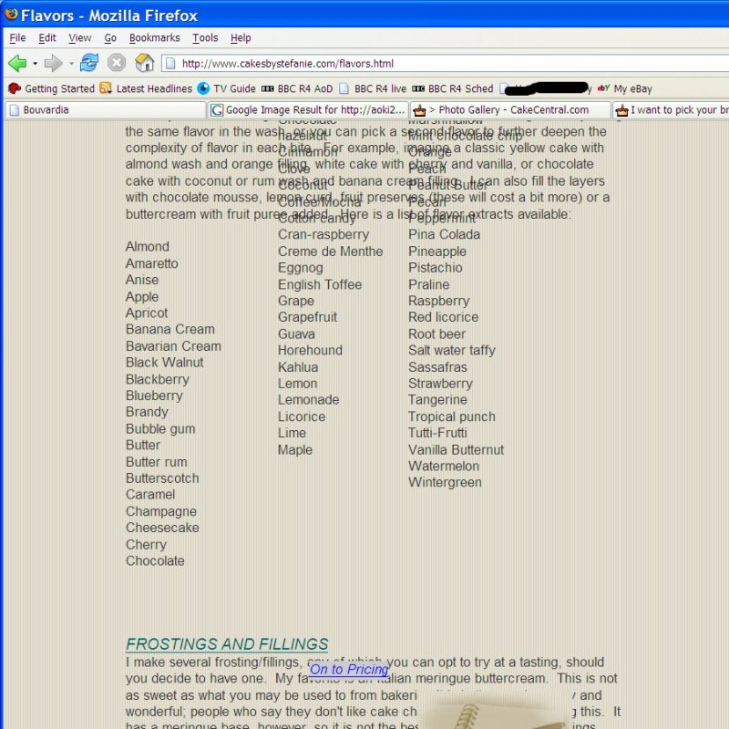
This is what the Flavors looks like when I view it in my browser:
Great job!! can't wait to have one of my own!!
I agree on the a lot of read... on the about me I think the most important 2 paragraphs are at the very bottom.. and most people wouldn't even make it that far in their reading! ![]()
About time devoted to one cake, and from scratch, organic, etc...
I would probably put that right on the home page somehow.. no need to explain on the home page what your pages are..people know what an about me, gallery, flavors, etc are just by their titles.. I would highlight your unique qualities instead right front and center.. and cut out the unnecessary stuff.
Oh, maybe also have a more prominent or separate link to your special occassion cakes.. someone going to your site to look at those may miss it at the bottom of the page of weddings.... I know when I clicked on gallery I thought to myself, "oh, she must only do weddings".. totally missed the small link at the bottom of the page.
HTH!! ![]()
As with the post above me some people may be getting that effect from having a different screen resolution.
If I set my screen resolution to 800x600 I get that scrunched look to your flavors page. If I set it to 1024x768 it's fine for me. I use Firefox as well btw so while your page might have issues with Firefox it seems to be working fine for me.
Just a head up that it might just be that people use different screen resolutions on their computers and that may be what causes things like that.'
Oh and it looks great I really love it and can imagine all the work that you have put in it so far.
Quote by @%username% on %date%
%body%