


You're welcome!
I used to proof-read my friends' english assignments at school (many moons ago!), because I'm so anal when it comes to things like that! ![]() Plus, I have a degree in Publishing (which I've never used, that included proof-reading - it finally came in handy!
Plus, I have a degree in Publishing (which I've never used, that included proof-reading - it finally came in handy! ![]() )
)
Kelly

I work in an advertising agency as a graphic designer, so I design/work with logos and whatnot pretty much all day.
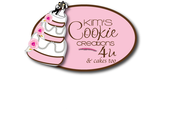
In my opinion (please note: I am not trying to be a jerk in any way), I think both are very hard to read. I would take out the cake completely, and use a logo that works more with an easy-to-read font, and develop a symbol to place with the text. Not only would it look more professional, but it would also be easier to read, as well as a bit more unique. I would also keep the colors to a maximum of three colors. The cake makes it seem kind of generic and 'clip-art'-ish to me. The logo utilizes too many different fonts, too close together. Also seems slightly off-balance.
God...I sound like I'm being such a jerk, but I'm just trying to be honest and helpful here, as I do have experience with this sort of thing on an everyday basis.
Also, something is throwing me off - the cake is in the logo, but the title is for cookie creations.
Once again, I'm not trying to be an ass - just trying to give some serious and helpful input.

I work in an advertising agency as a graphic designer, so I design/work with logos and whatnot pretty much all day.
In my opinion (please note: I am not trying to be a jerk in any way), I think both are very hard to read. I would take out the cake completely, and use a logo that works more with an easy-to-read font, and develop a symbol to place with the text. Not only would it look more professional, but it would also be easier to read, as well as a bit more unique. I would also keep the colors to a maximum of three colors. The cake makes it seem kind of generic and 'clip-art'-ish to me. The logo utilizes too many different fonts, too close together. Also seems slightly off-balance.
God...I sound like I'm being such a jerk, but I'm just trying to be honest and helpful here, as I do have experience with this sort of thing on an everyday basis.
Also, something is throwing me off - the cake is in the logo, but the title is for cookie creations.
Once again, I'm not trying to be an ass - just trying to give some serious and helpful input.
Not to worry, I don't think you're being a j... or an a.. If I didn't want input I wouldn't have put it here on CC .. I value your honesty, especially from someone who does this for a living!!
So thank you... ![]()

I work in an advertising agency as a graphic designer, so I design/work with logos and whatnot pretty much all day.
In my opinion (please note: I am not trying to be a jerk in any way), I think both are very hard to read. I would take out the cake completely, and use a logo that works more with an easy-to-read font, and develop a symbol to place with the text. Not only would it look more professional, but it would also be easier to read, as well as a bit more unique. I would also keep the colors to a maximum of three colors. The cake makes it seem kind of generic and 'clip-art'-ish to me. The logo utilizes too many different fonts, too close together. Also seems slightly off-balance.
God...I sound like I'm being such a jerk, but I'm just trying to be honest and helpful here, as I do have experience with this sort of thing on an everyday basis.
Also, something is throwing me off - the cake is in the logo, but the title is for cookie creations.
Once again, I'm not trying to be an ass - just trying to give some serious and helpful input.
I agree completely. I also think the "4U" should be replaced with "and cakes too!" or something like that if you plan to keep the cake. But the advice from above is great - needs to be cleaner, needs to be consistent fonts...


I like the first one, the swoosh on the second one just looks odd to me.


I know no one has brought this up so it is probably just me, but the tilt on the cake throws me off. I think it is too tilted. It might look a little better if it was straight up and down.
Just me though so I could be wrong,
Heather
i like it, its simplistic, creative. However it looks kind of, well, kiddie. Were you trying to fit every font you could on it? The yellow thing on the second one looks out of place with all the pink/ brown. The reat is pretty kwel though. ![]()
what doesn't kill u makes u stronger

I really like #1 - are you going to post a copy of the changes?
Would you be willing to pm me the info for the person on ebay that is doing this for you? Are they expensive? I got a quote of $400 from one person and since this is an "on the side" thing for me, that was more than I was wanting to spend!! I'd be happy to tell them you referred me!
Very cute!!

I like the first one better.
I also would assume that you just make cookies by the name. So I don't know how much wedding cake business you are going to attract.
I'm looking for someone to make a logo. Would you be willing to share who did yours?

i would also be interested in that name, if you don't mind? (logo designer)
Someone is doing this on eBay?
Yikes...anyone who wants a logo, I'll do three comps for them for $250. I could also set up PDF files for letterhead/orderforms/business cards/labels/etc (haven't developed a cost yet) and all you would have to do is take the file to a local printer and have it done.
Once again, I'm not trying to advertise in any way. I just don't want anyone getting scammed by someone on eBay.
I will PM everyone who would like the person's name who did this.
I won the bid for $19.99. I know it's a super deal, and for now is more in line with the price I wanted to pay. So far she has sent me 6 different designs and I choose those two as contenders. She will also send me the files for everything I need to do with it such as business cards, labels etc.
It was me that asked for that paticular cake, I liked it and thought it was fun.. and that's what I asked for, something whimsical and fun in my logo.
oneprimalscream - I would have loved to have someone like you do it for me, but I just can't afford it at this time. My budget is tight for getting this up and running. But hey in the future, you never know... ![]()
Yes I will post the new changes.. I've asked her to do a couple of things as well as add... & cakes too
Thanks everyone for your great ideas and input!!! 
Yeah...it's always hard for new businesses. I work for an agency, and people come in with a budget of a couple-hundred dollars, which is really hard for us to do. Usually, our first bid is $600 for three logo comps. EEEEeeek...I wouldn't want to pay it! ![]() But apparently, there are tons of people who DO have that budget...I'm just not one of them. Which is why I'm glad I learned how to use all the programs when I was a bored, antisocial teenager
But apparently, there are tons of people who DO have that budget...I'm just not one of them. Which is why I'm glad I learned how to use all the programs when I was a bored, antisocial teenager ![]() Hehe...
Hehe...
So, for people with a lower budget that DON'T come through the agency, I usually give them a deal for $250, plus I can set up custom business cards/letterhead/etc for a small additional fee.
Good luck to everyone in need of one!

I had a deal with an ex friend of mine who was going to go into business with me. I was going to design all the logos, letter head, banners, business cards, etc. and she was going to buy the printing supplies. Well I got to thinking about it and I can do that for anyone lol. I design my business cards in Publisher as well as my sticky back labels and just go to walmart or staples and purchase Avery or generic products to do the printing. I've charged as much as $50.~ for an entire set and as little as $20.~ just for business cards. I did 100 business cards last month for a friend of a friend who does lawn care and he paid the two of us $30.~ she kept $10.~ and gave me $20.~ the 10 covered the cost of her ink useage and the card paper she used and the 20 covered my time (2 hours designing on a computer that didn't have the programs I needed lol)
You really should charge more. Even if you are doing the printing yourself, I would at least charge $50 for designing/printing 100 cards.
I do all of my work in Photoshop/Illustrator/InDesign.

I like nr. 2, and think the bride and groom is fun.

I like the design allot but it does look allot like mine. I have used it for years but a embroiderer recently told me that my cake needed to have less detail because it would look "sloppy" in thread. Keep in mind I have had this logo embroidered before and she was right people have to get up close to my chest ![]() to read it!!!!!!
to read it!!!!!!
I would stay with 3 colors, pink, brown and white. Personally I would go darker/more intense pink. I am ordering pastel pink chef coats and your pink logo wouldn't show up on them.
The cake is a great idea but ask the designer to make a more simple cake, and I also agree that straighter cake would look more professional.
As for the cookie vs cake debate I didn't even notice the cookie part the first time! I would think of your potential customers seeing your logo at a 2 second glance..... what can you tell them is 2 seconds.
Otherwise I think you are on the right track!!!!
okay, here are the revised one's she has done so far... Think you need to click on them to get a better view.
Let me know if they are any better now and which one you like better!
Thanks all for your input!!!
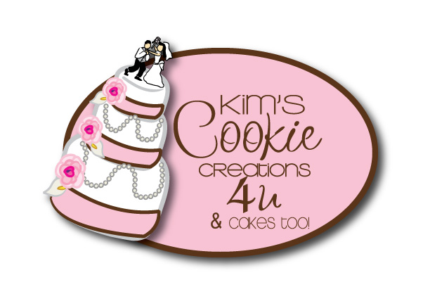

ladefly - Yeah I remembered that, and the designer said it's just the way the font on that one is.. I don't understand it, but that's what she says.. She'd have to change the font on the whole creations???
May get her to do that... geez she's gonna hate me for all the changes I keep asking of her...I feel guilty since I got it for so little $$
Thanks for the input, and keep it coming!!


I would get rid of the '4U & cakes too!'. When you say the whole thing...it seems a little long.
What about trying "Kim's Cake & Cookie Creations"? I know that sounds kind of plain, but it's a little less 'tongue-tying', in my opinion.
I would get rid of the '4U & cakes too!'. When you say the whole thing...it seems a little long.
What about trying "Kim's Cake & Cookie Creations"? I know that sounds kind of plain, but it's a little less 'tongue-tying', in my opinion.
I take your opinion serious since you do this everyday...
Question - if my legal name in Canada is "Kim's Cookie Creations 4 U" since the government wouldn't let me just have Cookie Creations... ugh..and my domain name is Cookiecreations4U...
Do you think it would be stupid to just have Kim's Cookie Creations or as you mentioned Kim's Cake and Cookie Creations.. since this isn't my legal name?
The only reason you have to register your name up here is so you can open up a business account at the bank and get a tax number..
I can legally use either of those names, just any cheques i receive would have to be made out to my registered name.
Does any of that make sense - I'm getting so confused.. ![]()
Thanks for your help! ![]()
Quote by @%username% on %date%
%body%