


I am really a computer friendly person but I'm not good at doing things like this. Please help me with I need to put on there in terms of writing and how I should do my pictures. (I am kinda limited on what I can do). But Please feel free to tell me what looks bad and what I need to do to improve. Thanks. http://sweettreatsbytammy.com


First off I love the color you have chosen for your site. I love purple!
What I would add is on your home page...the purple block that comes up next to your feature cake, instead of making that solid color, put pictures of different cakes or one of each style you make in each "window"! Don't change the shape but just add a picture in each one.
Give us the ability to click on each picture for a larger picture. On your special occasion cakes we can click on them but the picture doesn't get larger. I always like to have a closer look with a larger picture.
Other than that, I think you've got a great website on your hands and a great future with your business.
Amy

You may want to rename the Special Occasion Cakes to "Special Occasion Cakes & Cookies" since you have cookies in there - or create a seperate section for cookies. Otherwise looks good.

I'm attaching an illustration of a couple of quick changes...and comments on some others.
The empty big purple block bothered me. As did the aqua type.
Are you trying to look professional? I am assuming so. If not...then some of this won't matter to you.
I'd take the "welcome to" out in one place...it's redundant to have it on your page twice. I'd probably take out the "Hi," and maybe make your intro less "chatty."
You don't need "home page" on your tabs on the home page. I'd reduce the tabs on each page so that they are just one line...and don't include the tab for that particular page. Does that make sense? In other words. The home page would have a tab for wedding cakes, birthday cakes. special occasion cakes and flavors...but you don't need one for the home page because you're ON the home page. Then, when you go to the wedding page, your tabs are home page, special occasion, birthday and flavors. You don't need the one for weddings because your'e ON the wedding page. Your tab line would be much neater rather than having that single tab wrapping by itself down to the next line.
I'd take the rose petal cake off the front page. It is irrelevant there.
I'd do whatever it takes to have the line wrap better so that "desserts" doesn't end up all by itself. You may have to force a break further up in the paragraph and balance it that way.
I'd probably take off the counter. You don't see those much on professional sites.
Center your contact information.
On your flavors page, consider adding some cell padding, so your text isn't right next to the edge of the cell block. Check the spacing on that entire page. Do you mean for the cookie decorating party header not to be centered? And again...the aqua seems out of place.
You can't go back and reshoot your photos, of course, but in the future, be more careful about background, lighting, etc. If you want people to take you seriously, you should put some thought into the staging of your cakes, including the size and shape of the boards and what you cover the boards with.
Hope this helps.
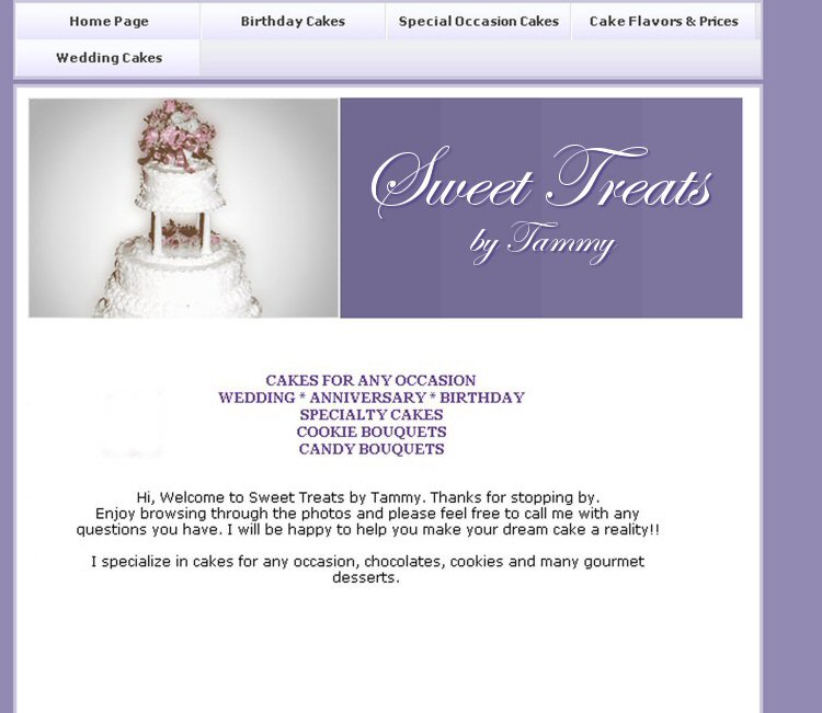

I also like the color purple..very soothing and inviting although I'm not sure what the large purple block is meant to be since it is blank.I would move the section tabs down to the middle of the page as they seem hard to find at the top.I find the aqua writing somewhat distracting and doesn't really go with the purple color.Other than that...I like it!! HTH ...LOL
Hi, I agree with the suggestion about removing your counter and adjusting the purple block--maybe a logo or some important text there? On your flavors page, it's distracting that you have so many font colors and italics. Your "special occasion" cakes seem mostly to be about holidays--so you might call that section "holidays," since birthdays and weddings are also special occasions and you have separate sections for those.
A couple of other little recommendations--first, you might want a contact form instead of posting your email directly on the page to avoid spambots. Second, on the thumbnail pages, I think you should have names or at least numbers to help people identify the cake or cookies if they contact you about them. In other words, if they call and say "I like the egg cake," you want to know exactly which one they're looking at from the site. A naming system now will help you keep organized when your photos grow, too.
Good luck!

I'd like to put my input in, if you don't mind.
I like Crimsicle's font in the purple block. The purple block by itself was not doing anything for me. LOL.
I would also center your writings.
I would love to also click on the pictures to make them bigger, because we all love ideas and would like to see them closer. As you probably know. LOL.
Also, I am not liking the gray background color behind some of the pics like on the Birthday cakes and special occasion cakes. It's too dull.
I think your address and phone number should be the same color as the purple block.
I also think there is too much chatting on the home page. I think, you need to take out the 3 little paragraphs and only put "Making your Dream Cake a Reality". Something to that nature.
And then put "feel free to email me or call me with any questions you may have". Put that just above your address and #.
I hope I did not offend you in anyway, You did a great site anyway. Thanks for reading my thoughts. ![]() ~Josie
~Josie
Quote by @%username% on %date%
%body%