


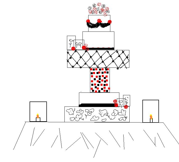
First let me apololgize for the kindergarten like rendition of a cake design. I was at work(supposed to be working) and all i have is microsoft paint! I have two cakes here, both similar, one has an extra layer. Let me give you some background, the empty squares on the two levels are going to be edible pics, the black and red blobs are pulled sugar flowers, the squares in the center layer are sugar tiles, the funny flower like swirls are brush embroidery and the black blob like swags are going to be fondant swags. And the candle holders are going to be sugar as well (say a prayer)
I just want this cake to be amazing and a show stopper....I want it to be cohesive as well.
Be honest...I can handle it! LOL

WOw . . looks like its going to be a lot of work!! i personally prefer the first one . . just seemed easier on the eye to me ![]()

Something with the tiles isn't sitting right with me. It's very distracting for some reason. I also think that you should kill the quilt/cross-hatch top tier and repeat the design of one of the lower tiers (going based on the first picture, I would repeat the swag somewhere else in the design). I don't know, it just seems like there is almost too much going on. But it looks like it's going to be awesome, and a lot of work for you!
I like the construction of the first one as well, but as AnnieCahill says, the tiles are distracting. If you're going to add edible photos, it's going to be very busy. I personally would leave the tiles off, but that's just me - - I prefer a simpler look.
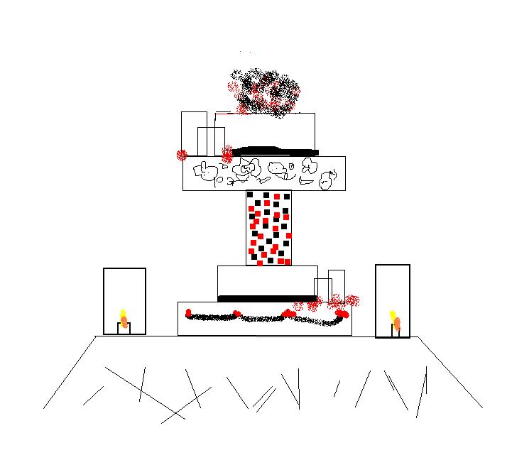
Thanks guys, sorry two of the same pics showed up...I will do another draft and post it tomorrow! Maybe if I do the tiles clear sugar instead of black and red? Or do a few tiles in groups instead of covering the whole thing?
Ok, here are the revamped pics....changed the colored tiles to clear (prob going to add a little luster dust to them) and toned down the the whole thing. The one picture has a smaller center then the first design...I think i like that one the best. I tried to scale the pic to what it will look like but it was hard to get it just right with the paint program...you guys get the idea! LOL
Thanks again for your feedback....
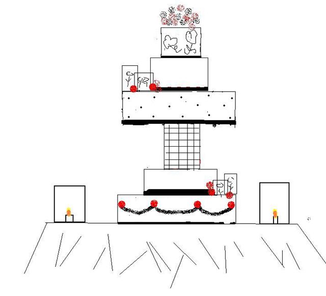

From an artist's viewpoint, I like the bottom tier to be the strongest, anchoring the composition. I like #3 of the revamped drawings. Wow, this is going to be an amazing cake. Hope you'll post completed cake.
I agree, I know the picture is off but even with it being just a picture I like the third one (not sure why the first pic was repeated! ) I will definitely post the finished piece, it's a competition cake for February and there are a few people on CC who really gave me lots of info that I need to thank!!
I also like the third pic of the revised drawings. It's going to be an amazing cake. Can't wait to see it!

I like the swags on the bottom, too, and I love the dots...good luck in the competition...
just a suggestion.... if you go with the first setup- a large cake on top of the tiles....what about having something hanging down from the border to fill in the open spaces- I've seen this done with sugar crystals and regular crystals....definitly a showstopper and would go nicely with your luster dust tiles....
I personally would leave the tiles off all together. Brush embroidery and tiles are such differnt styles, I don't think they go together. It would look like your are trying to show every technique you can do and you could end with a very uncohesive design.
I like the swags on the bottom, too, and I love the dots...good luck in the competition...
just a suggestion.... if you go with the first setup- a large cake on top of the tiles....what about having something hanging down from the border to fill in the open spaces- I've seen this done with sugar crystals and regular crystals....definitly a showstopper and would go nicely with your luster dust tiles....
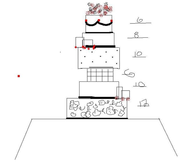
Thought about that but I think it would be way too much going on. I think if I were to do a tall tier it would have to be the very top tier or have just one layer above it to look like it flows. I have a few weeks so I can keep playing around with my idea.
Quote by @%username% on %date%
%body%