


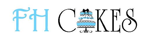
I was fortunate enough to find a Graphic Designer locally that worked out a trade with me, so I really didn't pay much for my logo which is great...but now that I have had it for a while I am starting not to like it!
After sitting here re-reading my tagline over and over I can't stand it...Am I being crazy or should I make some changes?
** sorry, can't figure out how to post my logo on here for you to see...please go to my site www.fhcakes.com **


My 7 year old (who has GREAT taste) and I both like it! You do amazing work.

I LOVE your logo - it's beautiful! The colors and damask design are really elegant. If it's your tagline you're worried about ("Custom cakes for all occasions") I guess you could probably come up with something more original. It gets the point across but I have seen it a lot on other cake websites. I'm sorry I don't have any ideas for you but I do think the logo itself is gorgeous!
I think it's pretty! Saw you're from Vancouver, had to say hi from a fellow NW baker! ![]()

Here it is without the tagline:
Or without the overlapping letters:
Or with the overlapping letters, but a little shadow added:


The picture of the cake on the left side of your logo is very nice, but as mentioned above the "CAKES" text is not strong enough. Texas_Rose's second image works better (nice job incorporating the gradient into the cake as well).
Kudos on offering gluten/dairy/peanut-free options. Just having peanut-free (are you also tree nut-free?) cake is huge and could be one of your main selling points -- I run a bakery specializing in allergy-free cakes and we have far more business than we can handle with just party cakes. Allergy-free birthday cakes are especially big because of the prevalence of food allergies in kids.
Thanks Texas_Rose for those examples...I too like the middle one, this was similar to an option I had when chosing my logo. I decided to go with the one I did because at the time I liked it more...but now I am reconsidering my choice.
This is such a hard decision...What do you all think, should I drop the tag line or keep it? I have been racking my brain trying to think of something more orgininal...
"Specializing in Allergy-Free Edible Art" (I am the only baker in my area that does Peanut-Free)
"Making the world a sweeter place"
"Specializing in Allergy-Free Edible Art" kind of sounds too clinical.
"Because life is sweet"
"Because life is delicious"
"Put the icing on your special day"
It depends on which direction you want to go...do you want to focus on wedding cakes with elaborate designs that happen to be available allergy-free, or do you want to push the allergy-free aspect with simpler party cakes?
Also, for my own business I wasn't too comfortable with the term "allergy-free", so we ended up using "allergy-friendly".

I think the "FH" should be in blue because this is what separates you from AB Cakes or CD Cakes. I would have personally put the image of the cake in place of the "A" in Cakes. And make it one line.
The logo on the website is a bit big. It takes up half the screen when you log on to your website.
I would leave out any tag line unless this is your niche and you are claiming this as your specialty. If you also happen to do this along with other things people might not get that and you'd unintentionally drive people away. If this is your niche then you'd have to appeal to a wider audience outside of your local area...i.e., being able to mail your cakes to the people who have allergies but since it looks like you're a home baker, I'd opt to appeal to a wider audience and drop the line.
Your work is good, you should keep caking...er, baking. ![]()
If this is your niche then you'd have to appeal to a wider audience outside of your local area.
Any decently-sized metro area would easily be able to support a home-based baker specializing in the niche market of baking for people with food allergies without having to ship outside the area. Larger areas can support these niche businesses with the additional overhead of a rented kitchen. I'm not sure the niche is large enough to support a retail shop on its own though.

FH_Cakes I do love your logo because it stands out & when people see it they know it's you. It separates you from the rest. However, if you do want to change it that would be totally up to you. Many companies revamp their logo and it works out just fine for them. IMO if you do change it don't go too far from your original so if a previous customer looks at it they don't think that it's a completely different company.
HTH
Wow...some great responses and feedback..Thank you!!
My niche is definatley peanut-free/allergen friendly. I am known for this as I started my business due to my own son having a life threatning peanut allergy. My husband thinks I will drive business away if I market that I am peanut-free, some people may think they can't get just a basic birthday cake from me...I do agree with him, this is why I tried to go with a simple tag line.
Thank you all for the comments and feedback, it has really helped!
The kids are asleep so I could play a little. Let's see if this works. The last time it I had trouble.
Okay, I like this better! Well done!
The kids are asleep so I could play a little. Let's see if this works. The last time it I had trouble.
Okay, I like this better! Well done!
I like this, too.
I am known for this as I started my business due to my own son having a life threatning peanut allergy. My husband thinks I will drive business away if I market that I am peanut-free, some people may think they can't get just a basic birthday cake from me...I do agree with him, this is why I tried to go with a simple tag line.
To play devil's advocate here, IMO if you aim at a niche you should embrace it and focus on those niche customers as your primary market, especially if you are the sole provider for those niche customers. If you end up losing customers outside your primary market (even after emphasizing that your cakes taste just as good as cakes with nuts) that's not really a big deal.
There is a huge unmet need out there in the niche you and I are focusing on, this will become painfully clear if you meet with local support groups dealing with food allergies and celiac.
My only concern with the logo itself is it kinda says to me you ONLY do high end cakes...
I guess I have a similiar issue with my logo as it kinda looks like I ONLY do "fun" cakes...?
www.whentalentscollide.com
I, too, vote for Texas Rose's #2 design. For some reason, I read "fish cakes" when I quickly glance at the JennyKim's (Maybe it's from being in the Northwest).
Pike Place Market (Seattle) has a bead shop with a wooden sign pointing to the shop with the words "BEAD SHOP". Because of the positioning of the letters, ask any visitor to read the sign and they always say "The Bread Shop".
I love your logo and the variations posted by Texas_Rose. I would love to know what graphics program you are using.
Photoshop ![]()
The kids are asleep so I could play a little. Let's see if this works. The last time it I had trouble.
Okay, I like this better! Well done!
I like this, too.
I like this one but I think the "Cakes" should be in more bold print...and that the "FH" should be above it, instead of to the left...
I also like TexasRose's last one except not the "FH" part...I like the "Cakes" font and the little tagline though.
I, too, vote for Texas Rose's #2 design. For some reason, I read "fish cakes" when I quickly glance at the JennyKim's (Maybe it's from being in the Northwest).
Pike Place Market (Seattle) has a bead shop with a wooden sign pointing to the shop with the words "BEAD SHOP". Because of the positioning of the letters, ask any visitor to read the sign and they always say "The Bread Shop".
Haha, now every time I see this, I see fish cakes!
I love your logo and the variations posted by Texas_Rose. I would love to know what graphics program you are using.
Photoshop
Photoshop is an excellent tool, but it is also pricey ($500+). If you want to play around with graphics editing, you can get much of the same functionality with Photoshop Elements, which costs $70.
http://www.amazon.com/dp/B003YGMEAQ/?tag=cakecentral-20
There are also some free alternatives but in my experience nothing beats Photoshop.
http://sixrevisions.com/graphics-design/10-excellent-open-source-and-free-alternatives-to-photoshop/
Corel Paint shop pro is what I use, it is way cheaper than Photo shop, and i think it is friendlier to use, just read the manual when you want to do something, it will take you step by step. LOVE IT!!
Quote by @%username% on %date%
%body%