


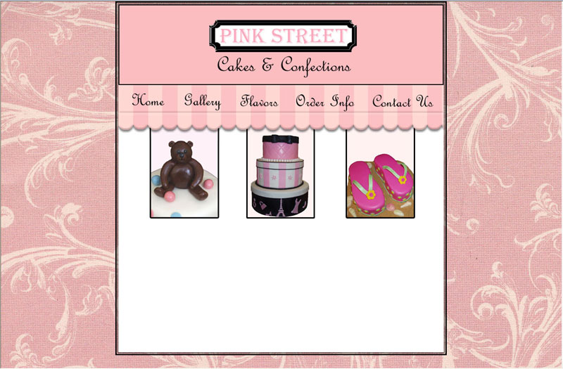

I like it. It has a French feel to it, which I love.


It's cute.. but I think I would bring the images down if you can.. they look odd and cut off that close to your border. ![]()


It's very nice. I like that French look it has. I can smell the cake baking... ![]()
Jeannie
Thanks everyone. Yes, I was going for the french look so I'm glad everyone else sees it.
As for the images, my copy for the homepage was going to go below that. Also, I was trying to make them look like windows with the canopy hanging over. I'm thinking if I move them down lower where would I put the copy?
Hmm... maybe I should take my hatbox cake and put that on the left side and make it bigger and then put all the copy on the right? What do you think?
Quote by @%username% on %date%
%body%