


Quick! Need Help With This Design!
Decorating By diamondsonblackvelvet13 Updated 12 Aug 2008 , 4:50pm by diamondsonblackvelvet13

I have this cake due tomorrow. I can't figure out what is wrong with this design. It's missing something.
The name of the clinic is Cactus Health Clinic and the cactus floating in there is their "logo."
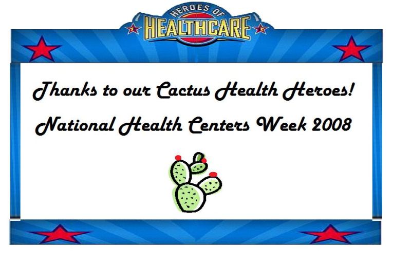
Maybe more red stars? (in the empty white area)
Yes, the white area is way too empty.
Maybe a stethoscope and a bandaid?
Theresa ![]()


I see nice symmetry in your design. Four corners stars, center placement of the Heroes of Healthcare sign at the top, and the two lines of text are almost identical in length.
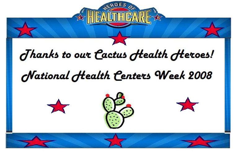
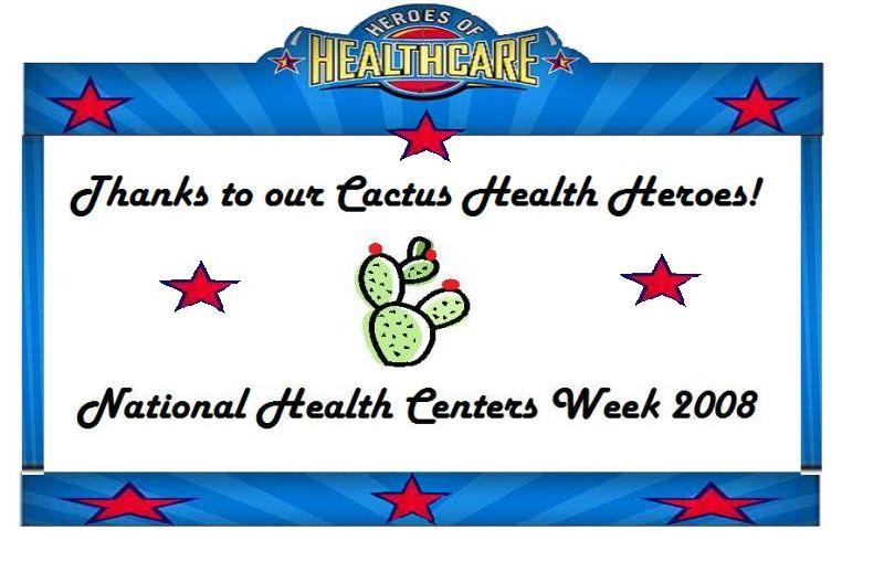
Maybe it's not missing anything. If you have the option of changing things a bit, and not just add more for the sake of more, what about this? To keep the symmetry, place the cactus in the center of the cake with a text line above and below it? You'll eliminate the big blank spaces at the bottom corners. The area around the cactus won't seem as empty this way.
Just my thoughts. hth! I bet the Heroes of Healthcare are really going to enjoy this cake! Good luck!![]()
Like this? What about cactus' on the top corners?
I found it! Thank you SO much! A combo of everyone's ideas! CC ROCKS!
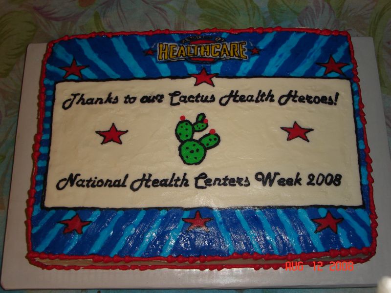
Ok! I got it done! Thank you call SO much for your help! The top is a buttercream transfer. The little rounded area at the top says "Heroes of Healthcare"
I am going to have to practice these BCT...getting harder to smooth.


Wow guys! You're making me blush! ![]() I've done the FBCT before, but not one this detailed. I am just glad it's over...maybe I can sneak in a nap.
I've done the FBCT before, but not one this detailed. I am just glad it's over...maybe I can sneak in a nap.
Quote by @%username% on %date%
%body%