Help Me Decide, Please

Business By cakeryluv Updated 8 May 2008 , 1:45pm by SugarBakerz

cakeryluv Cake Central Cake Decorator Profile
cakeryluv Posted 7 May 2008 , 9:02pm
post #1 of 24

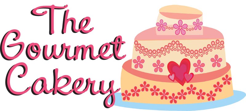
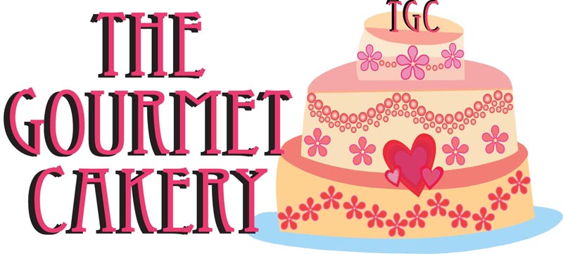
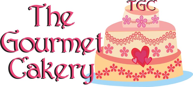
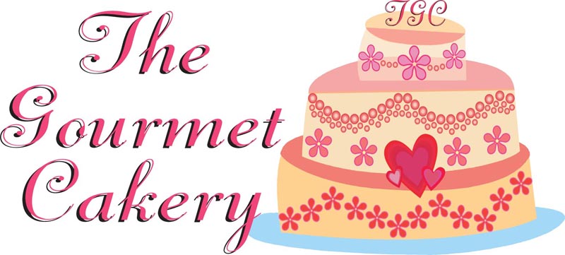
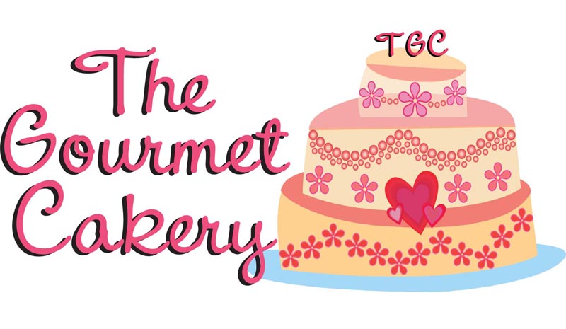
Thanks to your wonderful suggestions, I've played around with my logo and I came up with a few samples, I just can't decide on which font to use for my name. Any suggestions based on the images below?
LL
LL
LL
LL

23 replies
Tellis12 Cake Central Cake Decorator Profile
Tellis12 Posted 7 May 2008 , 9:18pm
post #2 of 24

First off, I love the cake logo. Adorable. My initial reaction is that I really like the very first one (v6) a lot, but after looking at them, I also really like the third one (v4). I think I might like the first the best if there was something on the top of it, like the other three. But they all look absolutely great.

CelebrationsbyLori Cake Central Cake Decorator Profile
CelebrationsbyLori Posted 7 May 2008 , 9:19pm
post #3 of 24

JMO, but I like the first one. It seems to flow with the funky style of the cake the best. The others are really good too, but need a more formal cake next to them.
Really, any of them would be good!
Lori

butternut Cake Central Cake Decorator Profile
butternut Posted 7 May 2008 , 9:25pm
post #4 of 24

All of them look great but the first one stands out more in my opinion. I really like that one best.

diamondsonblackvelvet13 Cake Central Cake Decorator Profile
diamondsonblackvelvet13 Posted 7 May 2008 , 9:30pm
post #5 of 24

I vote v6...simple and elegant

Dennysse Cake Central Cake Decorator Profile
Dennysse Posted 7 May 2008 , 9:33pm
post #6 of 24

V6 Love it!!!!Good luck!

canoewoman Cake Central Cake Decorator Profile
canoewoman Posted 7 May 2008 , 9:33pm
post #7 of 24

v4 gets my vote. The font is the easiest to read out of all of them.

Swede-cakes Cake Central Cake Decorator Profile
Swede-cakes Posted 7 May 2008 , 9:33pm
post #8 of 24

Nice work on all of them...thanks for putting them up for us all to see!

I agree with the other posters. The first one just "clicks" with regards to font and cake funkiness! If you put that really cool TGC topper on the first one, you've hit a homerun!

tracycakes Cake Central Cake Decorator Profile
tracycakes Posted 7 May 2008 , 9:36pm
post #9 of 24

I agree that they all look great but v6 just seems "right". The font matches that funkiness of cake. Funkiness...is that a word? icon_lol.gif sure it is.

matwogirls Cake Central Cake Decorator Profile
matwogirls Posted 7 May 2008 , 9:37pm
post #10 of 24

I vote for V6, I think the initials would look good on the cake as well though.

Janice

audrey0522 Cake Central Cake Decorator Profile
audrey0522 Posted 7 May 2008 , 9:38pm
post #11 of 24

The first one -V6!

doreenre Cake Central Cake Decorator Profile
doreenre Posted 7 May 2008 , 9:40pm
post #12 of 24

1st one! w/out the intials.

Very cute design!!

TejasRebel Cake Central Cake Decorator Profile
TejasRebel Posted 7 May 2008 , 9:47pm
post #13 of 24

Never fails that I have to put my two cents in icon_lol.gif

I think the first one suits the style of the cake well BUT the word "gourmet" implies something special to me. So... I like the style of the last one with the meaning of the word. Does that make sense at all?

cakeryluv Cake Central Cake Decorator Profile
cakeryluv Posted 7 May 2008 , 9:57pm
post #14 of 24

Tejas, you make perfect sense! That's why I played with so many fonts...just trying to find the right balance of funky vs upscale gourmet. I understand the complete "oxymoroness" icon_biggrin.gif of funky/gourmet, but that's sort of the point.

My original design had the V6 font, just a different cake. I like the cake much better this time around, and I actually have 15 font variations that I narrowed down to 6 and narrowed down again to 4.

I tried adding the initials to the first one...opinions?
LL

Cakebelle Cake Central Cake Decorator Profile
Cakebelle Posted 7 May 2008 , 10:02pm
post #15 of 24

The first one, v6. Very Cool!
Good luck! thumbs_up.gif

marthajo1 Cake Central Cake Decorator Profile
marthajo1 Posted 7 May 2008 , 10:06pm
post #16 of 24

V5 and V3 are hard to read one because all caps and the other there is too much offset with the shadow.

That said I vote for v6 too. I think no topper though. Too distractiong.

dinas27 Cake Central Cake Decorator Profile
dinas27 Posted 7 May 2008 , 10:10pm
post #17 of 24

another V6. Fun and a little funky... I think the cake topper is distracting in the other ones. If you want your intials on the cake for other uses (like on your apron or something) I think that the TGC would look cute in a slightly enlarged heart on the cake.

Amia Cake Central Cake Decorator Profile
Amia Posted 7 May 2008 , 10:23pm
post #18 of 24

I vote for V6 as well! That font just seems a little more fun. The others are a little fussy. icon_confused.gif KWIM? icon_confused.gif

bambuf Cake Central Cake Decorator Profile
bambuf Posted 7 May 2008 , 10:26pm
post #19 of 24

I like the first version (v6) too! I think it would look cool with the cake Monogram letters from the final version, though... just to muddy the waters for you a bit further!

luvscakes Cake Central Cake Decorator Profile
luvscakes Posted 8 May 2008 , 12:29am
post #20 of 24

I also like the 1st one with no initials- they look redundant in my opinionicon_smile.gif

Solecito Cake Central Cake Decorator Profile
Solecito Posted 8 May 2008 , 1:46am
post #21 of 24
Quote:
Originally Posted by luvscakes

I also like the 1st one with no initials- they look redundant in my opinionicon_smile.gif


Exactly what I thought!!

Laura102777 Cake Central Cake Decorator Profile
Laura102777 Posted 8 May 2008 , 3:02am
post #22 of 24

I like the first one with no initials, too.

cakeryluv Cake Central Cake Decorator Profile
cakeryluv Posted 8 May 2008 , 1:19pm
post #23 of 24

Well, you guys certainly made it easy! icon_smile.gif And it's good because V6 is the one I prefer too. DBF and a couple other family memebers like V3 best, but I think the font is a tiny bit too formal for the look I'm going for.

I tried putting the initials in the heart, but didn't really like the look of it. I think I will leave the initials off the top of the cake too...I was hoping I could eventually (when I'm rich and famous icon_rolleyes.gif ) use them interchangebly and people would know the graphic portion of the logo without always having to have the name next to it. But, I'm ok with leaving it off.

Thanks everyone for your feedback, I truly value and appreciate it! icon_smile.gif

SugarBakerz Cake Central Cake Decorator Profile
SugarBakerz Posted 8 May 2008 , 1:45pm
post #24 of 24

my vote is for # 2, the writing adds to the whimsical feel of the cake graphic... great logo, I am envious icon_smile.gif Good luck and do let us know what you decide!

Quote by @%username% on %date%

%body%