


My Website Is Almost Finished And Published...any Tips?
Business By aprilcake Updated 6 Apr 2008 , 2:52am by supremecakes
Hi girls...i am so excited...my website is almost done being created the lady told me just a few minutes ago! woohoo! I was just wondering as fellow bakers, is there anything I should definitely have on my website that has helped you out and you wouldnt be without? whether it be the wording, categories, what not...any tips/advice on making a beautiful looking cake site so that when people come to it, they just want to buy a cake so bad ... :0)
April :0)


Avoid music or any kind of noise. Lots of bride are looking at cakes while at their job and if they sign into a website with wedding music, they will click out immediately so they dont' get caught and in trouble by the boss. So music can be a deterent.
The "About Us" page should have info pertaining to your cake skills ... it should give them a solid, confident feeling about ordering a cake with you; it should validiate your skill. It's not your bioography.
There are mixed views on this one, but I like having the email to contact you spelled out ... not just a "click here". Most "click here" contact is via Microsoft Outlook Explorer. My laptop does not have that loaded since I don't use that email ... I use my website email exclusively. So I am unable to contact someone via a "click here". But if they have the email address spelled out, I can copy-n-paste it into my email system and contact them.
If you are not going to print your whole address, be sure to list at least a city/state so people in California will not try to contact you in Virginia.
Watch your backgrounds. I came across one catering website that looked very pretty on screen, but when I printed out their menus, the background dominated the page and I couldn't read what was printed. Some fonts look nice on screen but don't print well. So test it .... what will your customer get if they print your webpage to put in their 3-ring notebook?
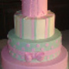
Use your best pics ... don't use pics with cereal boxes, decorating bags and crumpled dishtowels on the counter next to the cake.

Avoid music or any kind of noise........Use your best pics ... don't use pics with cereal boxes, decorating bags and crumpled dishtowels on the counter next to the cake.
Those are the two things I hate the most when I am looking at a cake website, or any website really. Also, when there are "tails" on the mouse pointer. Sometimes that is really distracting and hides the cake pictures. Your home page is amazing, can't wait to see the rest! 

I have heard that the majority of people do not like flash sites. Personally, I hate them. I can't stand it when I'm trying to read something or mouse over a link and it jumps around. Gah!
I agree with the music thing and backgrounds.
I think putting a price list, if you haven't already, is almost a must. It will weed out the clients who can't afford you and save you time from having to tell everyone your pricing.
I love the artwork on your home page. It's great! The font is very nice too. I'm a font freak. LOL.
Looks good. Can't wait to see the rest!
I haven't even looked at your site yet (it's minimized in my tray), but I see that the title of the page is "Home Page". THAT annoys the crap out of me when I see that. It should always be your business name or something related!
Also, now that I look at it.. I like the design itself, but the title image is longer than my browser (I'm on a laptop).. so I have to scroll way over to the right to see. Taking into account how it'll look on different screen resolutions is a good idea.
As for what I wouldn't be without.. second the good photos / no music thing.. but I also get a lot of brides who mention my blog. So I'd say a blog.
oh thank you all for the info!
About the homepage thing...i agree with you...we are just not done yet with the site...hopefully tonight it will be done! about the blog thing...i have no clue what I would blog about...lol any ideas?
oh and the page alignment thing was actually bad and so the designer went back in and changed it...if you try it now it should be fine!
April :0)
Much better! But what is with the picture of the blond chick as it loads?
The blonde chick.....OMG I thought I was seeing things! LOL! So I'm not the only one getting that then. whew!

Your designer rox.......the fonts are shaded and highlighted perfectly.....they really pop...i was a signpainter in a former life so i really love letters...and the whimsey cakes could not be cuter...kudos to your designer...VERY TALENTED!


I enjoyed looking at your website. The only thing I would suggest and maybe it is just me. I might make your photos more like a book or something with the arrows to flip through instead of having to scroll down the page. I'm taking it that you are new to this business or at least the website part? I am new to this and live in Georgia. I just set up my website and am still working on it. I was happy to see that our prices are pretty close. So I don't feel like I'm way off. Good luck and God bless.
ITS OFFICIALLY LIVE NOW!!! WOOHOO!!!
For those of you wondering the designer is www.capturedlovedesigns.com
Hope that helps!
Thanks...within two months I will be adding 10 cakes at least and so I will definitely need to re-arrange and do something different with the cake gallery!

OK, my pet peeve is grammar. On your home page there is a run-on sentence, and several sentences could be re-worded to read better. I think we need to present ourselves as professionals; and that includes through our speech and writing.
I would be happy to make some suggestions, but I don't have the time right now (I'm at work ![]() ).
).
I can always PM you later.

Hey April!
I am a "student" web designer myself and would make a few suggestions. Before I do, I just want to say, your design is very nice and your logo is well-made. Tell your designer great job.
Suggestions:
1. Use a white background instead of pink on your gallery page and possibly on all your pages for more conformity as to look, as well as elegance.
2. Very important: the bottom of every page needs to have a link back "home" as well as all the other pages in your site. This is to tie the site together and help someone to unstick where they are.
3. Put your contact info on the bottom of every page so someone who is excited about your work can easily reach you without having to search really hard.
4. Make your counter invisible. Your designer should be able to hide your counter. It is generally considered tacky and a sign of a home-made site and not professional.
5. Get rid of the "GoDaddy.com is the world's #1 ICANN-accredited domain name registrar!" if you can. This is your site. Don't advertise for anyone else inadvertantly, plus I think it is sort of tacky.
6. Change "Contact" to "contact me" or "contact us". Also change your "cake gallery" to "gallery" incase you expand into cookies or gumpaste flowers, etc...down the road
7. You can combine "wedding", "special occasion cakes" and "cupcakes and favors" into "how to order" or something like that, if all the links do is take you to an informational page and not pictures of those types of cakes.
Just some suggestions. Hope they help a tiny bit. ![]()
Loriana (Lisa)
thanks.. the background was actually white but i didnt like it so i had her change it to light pink...hope its ok
i dont like the counter either...i am going to have it removed.
i dont know if I can have the godaddy sign at the bottom removed either...but I will check!
i like the gallery idea! instead of cake gallery! Thanks!

Your site looks great, but you need some <Meta> key word and content descriptions in your heading - for Google to find. BOB
Send me an email: [email protected] so I can send you some info. BOB
Quote by @%username% on %date%
%body%