


Need Opinions My Website Banner/logo (I Added The Picture)
Business By fragglerock1 Updated 18 Oct 2007 , 6:38pm by fragglerock1

I've already told my designer that I thought the dots over powered the text a little. So she's going to shrink the dots, stretch the text and make "Keico's Confections" a little darker/bigger. Also she's going to make the "t" in Sweet shorter so it doesn't cross the exclamation point, right now it looks like Sweett. Do you think my suggestions were good ones, does it look fine the way it is or do you not like it at all. She's also going to incorporate the same desgn concept into a logo for my business cards and stationary. Any input would be greatly appreciated. TIA
Trying this again:
I agree with your suggestions. Is the name of your business "Keico's Confections" or is Sweet a part of the title? I'd put Keico's Confections in white and the Sweet in pink so Keico's stands out more...and maybe put the Keico's part above the Sweet part...unless it's suppossed to be "Sweet! Keico's Confections"....
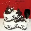

Your suggestions are good. The only thing is like Peardream mentioned, the word Seet stands out and the rest sor tof blends in with the banner. Other than that it looks great.
Vicky

I think you both had great suggestions! Dots are definitely too big, that will make a big difference when they are sized down a bit. And white text will always pop out more than dark text so the text in white should be your "main" text like peardream mentions - just depends on what you want to be read first. Right now Sweet! is definitely asserting more importance than Keico's Confections.
Post again with any changes ![]()
I knew I was missing something! I will tell her to switch Keico's Confecitons and Sweet, the former is the business name and the latter is just the tagline. Thanks so much for your help.
Quote by @%username% on %date%
%body%