


I think I really like it. It's not what I had originally planned, but It's growing on me. What do you all think ?

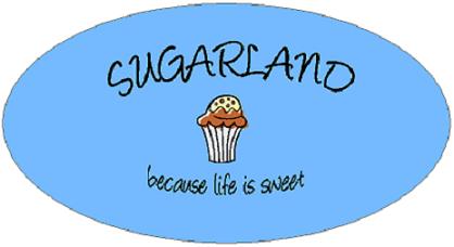
I wanted the font to look like it had been written in icing, and I think that turned out great. The blue isn't showing up quite right. We use Pantone color 305. UNC is Pantone 278, so it's a little more Robin's egg blue.


I like the writting and the color but can I ask why the ice cream as apposed to cake?
I like the writting and the color but can I ask why the ice cream as apposed to cake?
It's supposed to be abstract enough to either be a dish of gelato of a big fluffy cupcake, since we have both.

Well good for you love your logo very nice!!!!! where in TX are you?

The name comes from my very first cookbook, which I got somewhere between the ages of 3 and 4. It is from the Imperial Sugar Company, which is in Sugarland Texas.
The book is hilarious. I have notes in it that I can't even read. Apparently I knew how to make letters around age four, but what they say is a complete mystery. I have ingredients circled and scratched out. There are notes on a pancake recipe that seem to indicate that I thought we should make it for Mothers Day 1972.
We are framing it and hanging it in the decorating space in the kitchen.

 I love it!!! And it's CAROLINA BLUE, rofl!!! Even better.............

Very nice txkat!! I like it a lot. It's simple and to the point and not overdone and cutesy.

Love it! (It the name of my favorite country group too!)


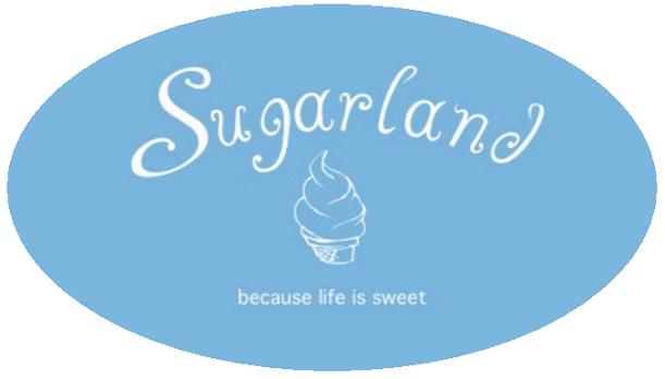
I dont want to sound mean and please do not take my opinion as an insult. I think the graphic looks like a cheap soft serve ice cream cone. By looking at your computer layout for your new shop, which looks great by the way, I would think something more upscale would have been better. The color and the text font look good but I think the rest is lacking IMO. Is your main business going to be ice cream? Just my thoughts.
I dont want to sound mean and please do not take my opinion as an insult. I think the graphic looks like a cheap soft serve ice cream cone. By looking at your computer layout for your new shop, which looks great by the way, I would think something more upscale would have been better. The color and the text font look good but I think the rest is lacking IMO. Is your main business going to be ice cream? Just my thoughts.
It is good to hear your opinion. I don't take it personally. I had originally wanted a graphic that was more abstract so that it referenced both the baked goods and the gelato. The graphic artist sent this over, but there is one more revision, so I'll mention the "cone" look.

This is just my honest opinion..so hear me out ![]()
Obviously I don't know you and we have never met..so I'm going solely based on what I have seen on here in pictures and content of your posts. (This may be way off in some psychological corner-but this is jsut the way I see it)
From what I can tell, you are a very strong person who has a great creative talent, strong opinions regarding your talent, incredible work ethic and a very mature demeanor.
With that said, your logo is nice...but lacks that "strong" quality that I would expect. I mean I understand the gelato aspect of it..I just think its a little "soft" for someone with such strong convictions regarding her business. With that said, I love the color...maybe just a logo with some more defined lines and stronger shapes, to kind of put your foot out there and say "you NEED to come in here, because I know what I'm doing and I'm good at it and dammit everything in here is awesome! ![]() "
"
(that may be a little over the top...but thats what I think ![]() )
)
I mean this with all the best intentions..and I wish you the best of luck ![]()
lol...my best friend is a psych major...its rubbing off...can you tell? ![]()
HTH

Don't settle....what did you originally have in mind?

It's cute, but being a graphic designer that works at an advertising agency, I do this every single day, and in my opinion, I don't feel that it is a 'strong' logo. It needs to be more isolated; not just a white font on a blue background, because any business collateral that you have in the future should be consistent with the logo, so in that case everything you have would have to be blue with white text. And you definetly want to keep things consistent (i.e.: business cards, fliers, magazine/newspaper ads) because that's how people grow to identify you. Consistency really does have a lot to do with identity - there are people who have all their business collateral designed by the agency I work for, and then someone offers them a 'cheaper' media buy in a magazine, and they take it - and honestly, people do not recognize the ads, and half of the readers bypass the ad. So if you are going to have a solid block of blue for the background, be sure to be consistent with that.
I would recommend branding your company with an iconic logo - perhaps tightening up the icecream cone to be more of a logo, and look less clip art-ish.
I'm totally not trying to be a jerk, so I apologize if it seems that way. I just have a lot of experience with this stuff under my belt, and am only trying to help.

Sorry kat,
I'm not lovin' the graphic either. I agree with chqtpi and CakeMasterG. Based on the renderings of your shop, I'm hoping for something stronger, snappier and upscale. I do like the color, though! ![]()
Best,
Lisa
My first impression was that it was off-center "Sugarland" looks off-center because it's missing the line down on the 'd'. So you have the curly-cue from the S, but nothing to balance it out on the right-hand side. So you see more blue on the right than the left. The graphic does tend to look more like an ice cream cone, so I don't know if that could be revised a bit.
I really like the 'because life is sweet' line and that it's in lower case. And it's a great name for a store. Good luck with everything.
Hmmm.. I can see what everyone is talking about. What about making it in all caps? Or making it eliptical rather than square.. that will help with the disproportion on either side. I'd be interested in seeing your original idea too. Remember.. this is YOUR image.. and the image your customers will associate with YOU.. don't settle if it's not what you want. I am bored so I was fooling around a little.. check this out. Obviously I don't have your image so I stuck a generic clipart image in there.. I tried to get close to your original font.. but I kow it's not exact.. and I know it's not perfect, but Paint doesn't give you much for options.. ![]()
As you can see i am obviously slacking off and trying to avoid cleaning this morning.. ![]()
Here's another idea using your image..
This is just my honest opinion..so hear me out
Obviously I don't know you and we have never met..so I'm going solely based on what I have seen on here in pictures and content of your posts. (This may be way off in some psychological corner-but this is jsut the way I see it)
From what I can tell, you are a very strong person who has a great creative talent, strong opinions regarding your talent, incredible work ethic and a very mature demeanor.
With that said, your logo is nice...but lacks that "strong" quality that I would expect. I mean I understand the gelato aspect of it..I just think its a little "soft" for someone with such strong convictions regarding her business. With that said, I love the color...maybe just a logo with some more defined lines and stronger shapes, to kind of put your foot out there and say "you NEED to come in here, because I know what I'm doing and I'm good at it and dammit everything in here is awesome!
(that may be a little over the top...but thats what I think
I mean this with all the best intentions..and I wish you the best of luck
lol...my best friend is a psych major...its rubbing off...can you tell?
HTH
LOL!!! ![]()
![]() You must be talking to my husband who calls me little miss can't be wrong.
You must be talking to my husband who calls me little miss can't be wrong.
BTW have I told all you guys that you are awesome and I appreciate your imput!
txcat, If you ship me a box of your desserts I'd be glad to give you some more input. ![]()
![]()

I honestly think the Logo looks too soft..doesn't pull me in..can't wait to see what other ideas you have..Best of Luck! and where are you located- yummy!!!

I really like the simplicity of the design. They tend to be more eye catching to me personally, especially with the nice color and font.
First impression I think of those shops you see in touristy spots that sell ice cream, fudge, taffy, and caramel popcorn. It's definitely the wrong impression, but I only get ice cream cone from the logo and adding in the name "Sugarland" that is what comes to mind honestly.
With all the spectacular dessert and other wonderful offerings I think there must be a better way to represent that than an ice cream cone.
Quote by @%username% on %date%
%body%